Sherwin-Williams Dorian Gray (SW 7017) is a versatile mid-tone gray that effortlessly bridges the gap between modern elegance and timeless neutrality. With its understated charm and rich depth, this paint color offers a perfect backdrop for creating sophisticated interiors that feel warm, balanced, and inviting. Whether you're looking to refresh a single room or unify your entire home, Dorian Gray provides a refined palette that adapts seamlessly to various design styles and atmospheres.
Dorian Gray is more than just a simple gray; its nuanced undertones set it apart from cooler grays that can feel stark or sterile. This shade features a subtle hint of taupe and beige, lending it a warm and welcoming appearance. These undertones ensure that Dorian Gray pairs beautifully with both light and dark accents, making it a versatile choice for spaces that require depth without overwhelming the overall aesthetic.
This warmth also makes Dorian Gray ideal for areas where natural light plays a key role. In rooms with abundant sunlight, it may read as a soft, warm gray, while in dimmer spaces, its taupe undertones come forward to create a cozy ambiance.
One of the standout qualities of Sherwin-Williams Dorian Gray is its compatibility with a wide range of coordinating colors. Whether you're looking to layer neutrals or introduce bold contrasts, this shade offers endless possibilities:
Sherwin-Williams Dorian Gray is a designer favorite because of its ability to adapt to a wide range of interior applications. Whether you're revamping a single room or creating a cohesive look throughout your home, this shade offers endless possibilities:
Dorian Gray serves as a perfect neutral for living rooms, creating a calm and welcoming space. Pair it with plush furniture in creamy whites or deep navy accents for depth and texture. Add metallic finishes like brushed gold or matte black for a touch of elegance.
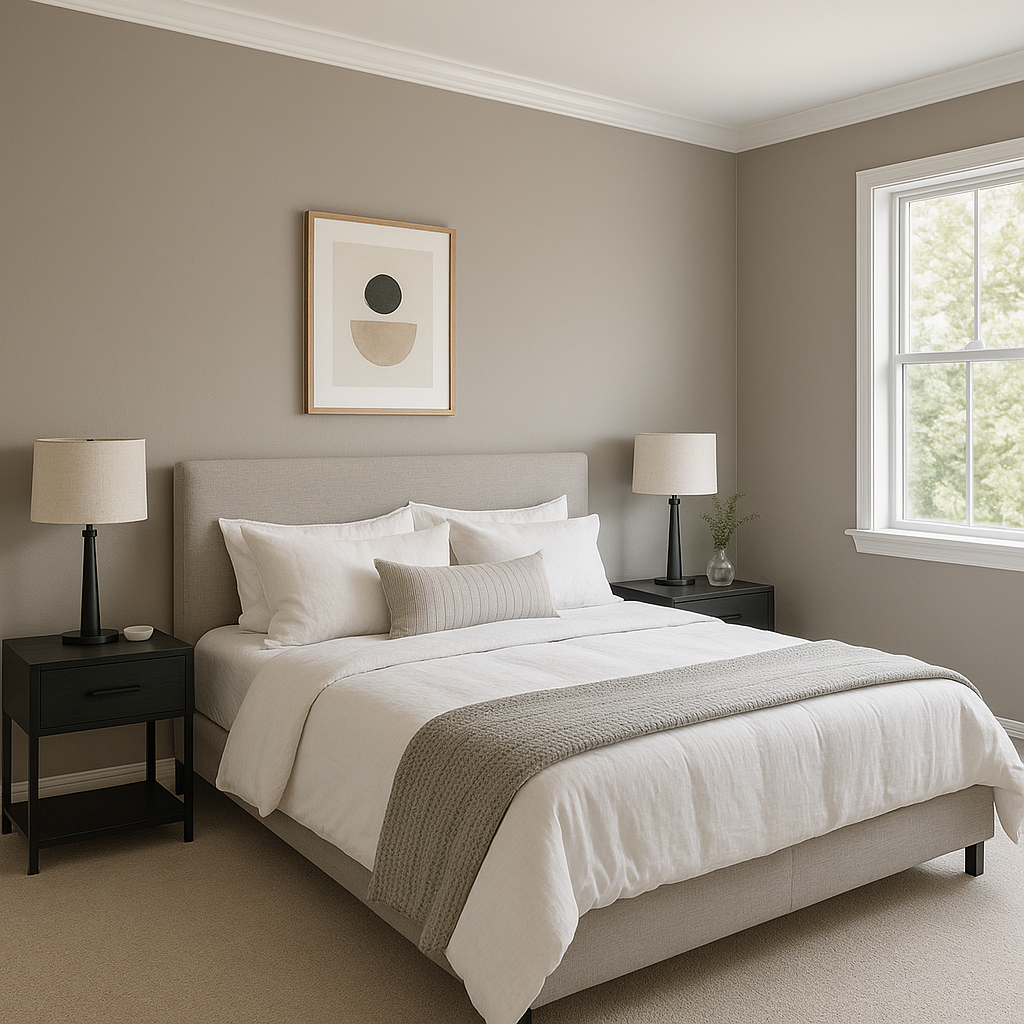
Bring tranquility to your bedroom by using Dorian Gray as the primary wall color. Its warm undertones pair beautifully with soft linens in muted blues, whites, or taupes. Consider adding wooden furniture or natural textures to enhance the cozy vibe.
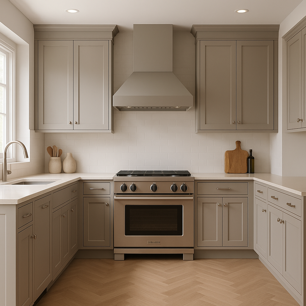
Dorian Gray is a sophisticated choice for kitchen cabinetry or bathroom walls. Pair it with crisp white countertops, subway tiles, and stainless steel or matte black fixtures for a modern yet timeless feel.
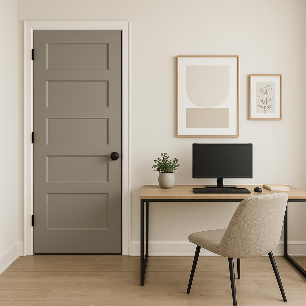
For a productive yet stylish workspace, Dorian Gray provides just the right amount of depth without feeling overpowering. Pair it with rich wood tones and navy accents for a polished and professional aesthetic.
Dorian Gray is not limited to interiors—it’s equally stunning as an exterior paint color. Its warm undertones work beautifully with stone accents, white trim, and darker shades like black or navy for doors.
Sherwin-Williams Dorian Gray (SW 7017) is a refined and versatile paint color that combines warmth, neutrality, and elegance. With its subtle taupe undertones and adaptability to a wide range of coordinating colors, Dorian Gray is an ideal choice for creating timeless spaces that feel both modern and inviting. Whether you’re designing a cozy living room, a serene bedroom, or a polished home office, this mid-tone gray is sure to elevate your interior design with sophistication and charm.
Note: These images were all generated with AI, there may be inaccurate color results. Please only use a general reference to get a rough idea of what a color may look like, we will continue to generate new images to improve accuracy.
View Colors Only by Brand (No Imagery):
Sherwin-Williams
|
Benjamin-Moore
|
Behr
|
Valspar
Live on the Eastern Slope of Colorado and looking for a local painting professional, check out all our painting services and reach out for a free estimate.
Copyright © 2026 : Wild Fox Painting Inc. : 12435 Mead Way, Littleton, CO 80125


