Sherwin-Williams Westhighland White 7566 is a classic, versatile off-white that exudes warmth and sophistication. This creamy hue strikes the perfect balance between soft elegance and functional neutrality, making it a go-to choice for homeowners and designers alike. Its adaptability and subtle undertones allow it to complement a wide array of design styles, from modern minimalism to cozy traditional spaces.
The beauty of Westhighland White lies in its gentle undertones. This color is a warm off-white with a creamy beige base that lends itself to a welcoming, inviting aesthetic. Unlike stark whites that can feel clinical or cold, Westhighland White has a subtle warmth that makes it feel approachable and cozy. While it leans warm, it stops short of being overly yellow, ensuring it maintains a refined and balanced look.
Its undertones work beautifully in both natural and artificial lighting, giving rooms a soft glow during the day and a comfortable ambiance in the evening. However, as with any paint color, testing it in your specific space is key, as lighting conditions can subtly shift its appearance.
One of the standout features of Westhighland White 7566 is its ability to coordinate seamlessly with a variety of other colors. Whether you're aiming for a monochromatic palette or adding depth with accents, here are some excellent pairings:
Neutral Pairings:
Combine Westhighland White with soft, earthy neutrals like Accessible Beige (SW 7036) or Balanced Beige (SW 7037) for a harmonious and understated look. These shades enhance the warm undertones without overwhelming the space.
Cool Accents:
To create contrast, consider pairing it with cool grays or blues like Silver Strand (SW 7057) or Naval (SW 6244). These shades bring a modern edge to the softness of Westhighland White.
Dramatic Depth:
Add drama with darker hues like Urbane Bronze (SW 7048) or Iron Ore (SW 7069). These deep, moody colors ground the space while allowing Westhighland White to shine as a bright, clean counterpoint.
Soft Pastels:
For a more playful or feminine look, pair it with pastels like Sea Salt (SW 6204) or Rainwashed (SW 6211). These soft, muted tones create a serene, spa-like atmosphere.
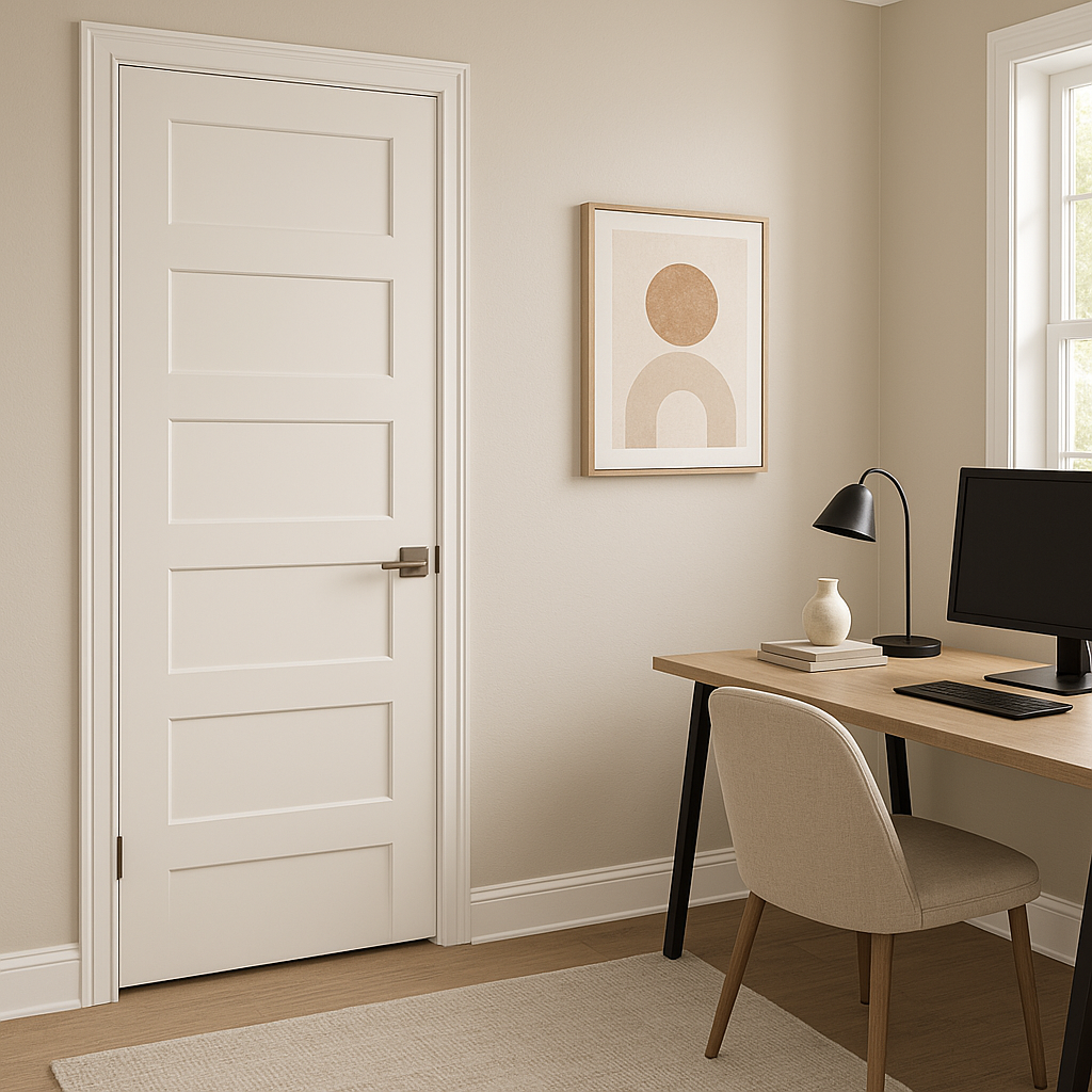
Westhighland White's versatility makes it a prime candidate for virtually any room in the home. Its warm, neutral nature allows it to work as both a primary wall color and a supporting trim or ceiling option. Here are some popular uses:
Living Rooms and Family Spaces:
Westhighland White creates an inviting and cozy atmosphere, making it perfect for communal spaces. Pair it with plush furnishings and warm wood tones for a welcoming, lived-in feel.
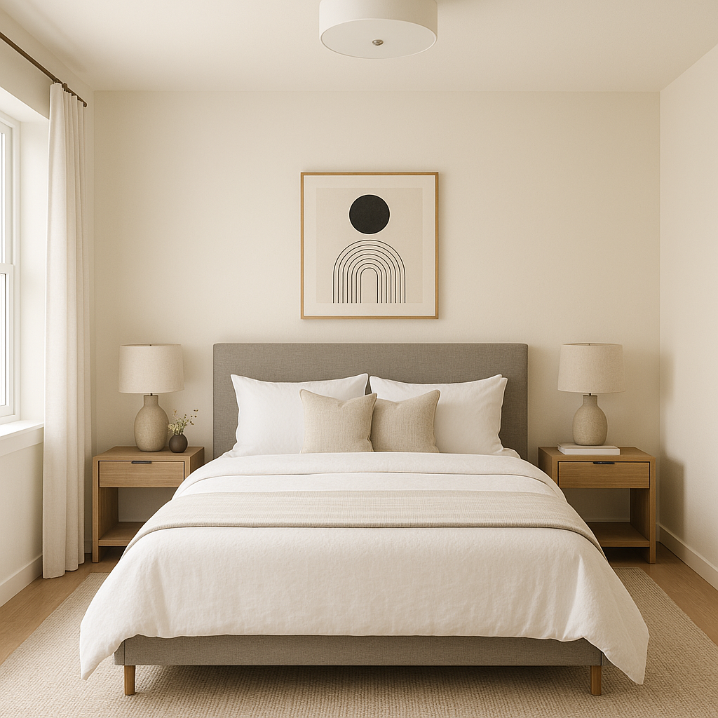
Bedrooms:
Its soft warmth makes it an excellent choice for bedrooms, where a calming and restful environment is key. Accent the space with layered textiles and muted tones for a serene retreat.
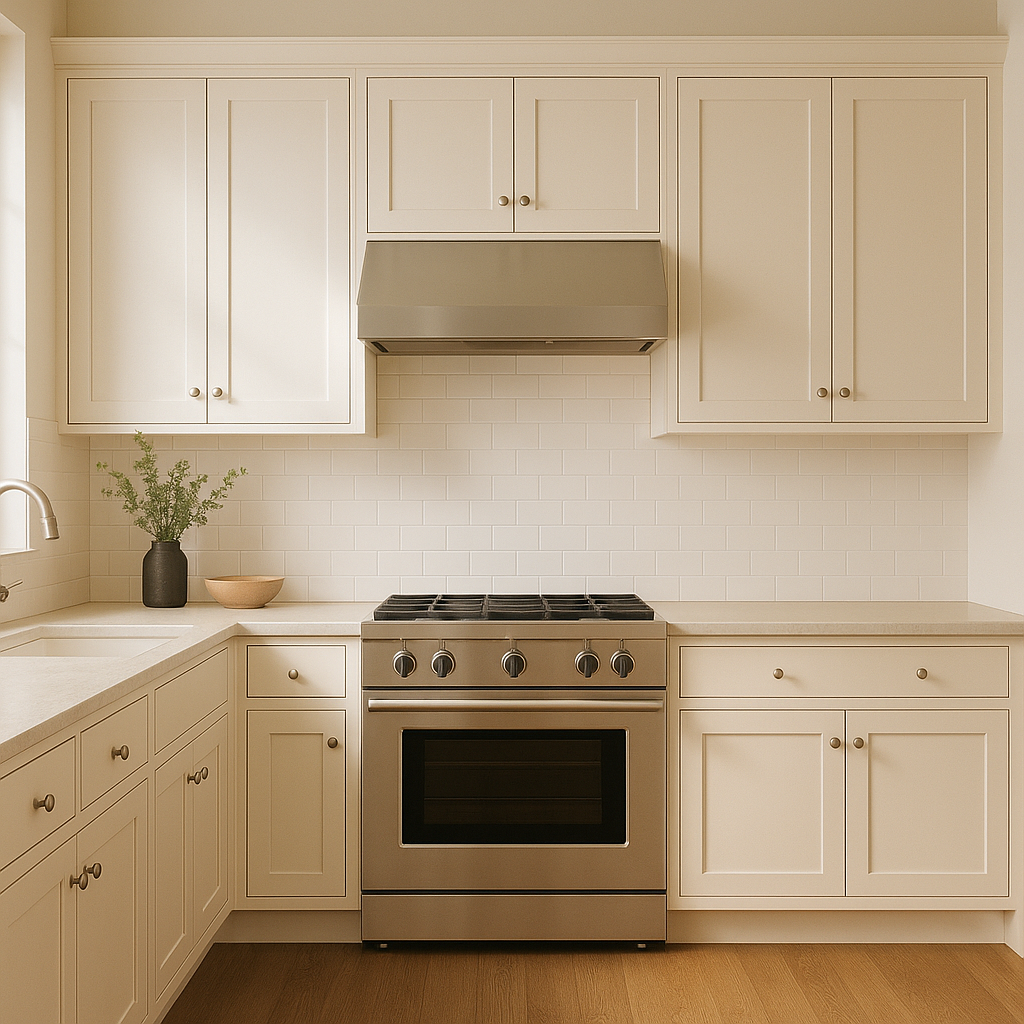
Kitchens:
Use Westhighland White on cabinets or walls to brighten up kitchens without the starkness of a true white. It pairs beautifully with natural stone countertops, wood flooring, and brass or black hardware.
Bathrooms:
In bathrooms, the creamy undertones of Westhighland White add an element of luxury and softness. Pair it with crisp white tiles or light gray accents for a clean, spa-like look.
Note: These images were all generated with AI, there may be inaccurate color results. Please only use a general reference to get a rough idea of what a color may look like, we will continue to generate new images to improve accuracy.
View Colors Only by Brand (No Imagery):
Sherwin-Williams
|
Benjamin-Moore
|
Behr
|
Valspar
Live on the Eastern Slope of Colorado and looking for a local painting professional, check out all our painting services and reach out for a free estimate.
Copyright © 2026 : Wild Fox Painting Inc. : 12435 Mead Way, Littleton, CO 80125


