Sherwin-Williams Alabaster (SW 7008) is a soft, creamy white that has become a favorite among homeowners and interior designers alike. Revered for its ability to create inviting, serene spaces, Alabaster is a versatile neutral that effortlessly balances warmth and brightness. Its subtle undertones and wide range of applications make it a go-to choice for achieving a classic yet contemporary aesthetic.
Alabaster is not your typical stark white. It features delicate beige and gray undertones, giving it a warm, slightly off-white appearance. These undertones prevent it from feeling cold or sterile, making it an ideal choice for spaces where comfort and coziness are paramount. Its warmth also ensures it pairs beautifully with a variety of other colors, from earthy tones to cooler hues.
One of the reasons Sherwin-Williams Alabaster is so popular is its ability to harmonize with a broad spectrum of colors. Whether you're looking to create a monochromatic palette or add contrast, Alabaster adapts seamlessly. Here are some coordinating colors to consider:
Sherwin-Williams Alabaster’s versatility makes it suitable for nearly every room and design style. Below are some of its most effective uses:
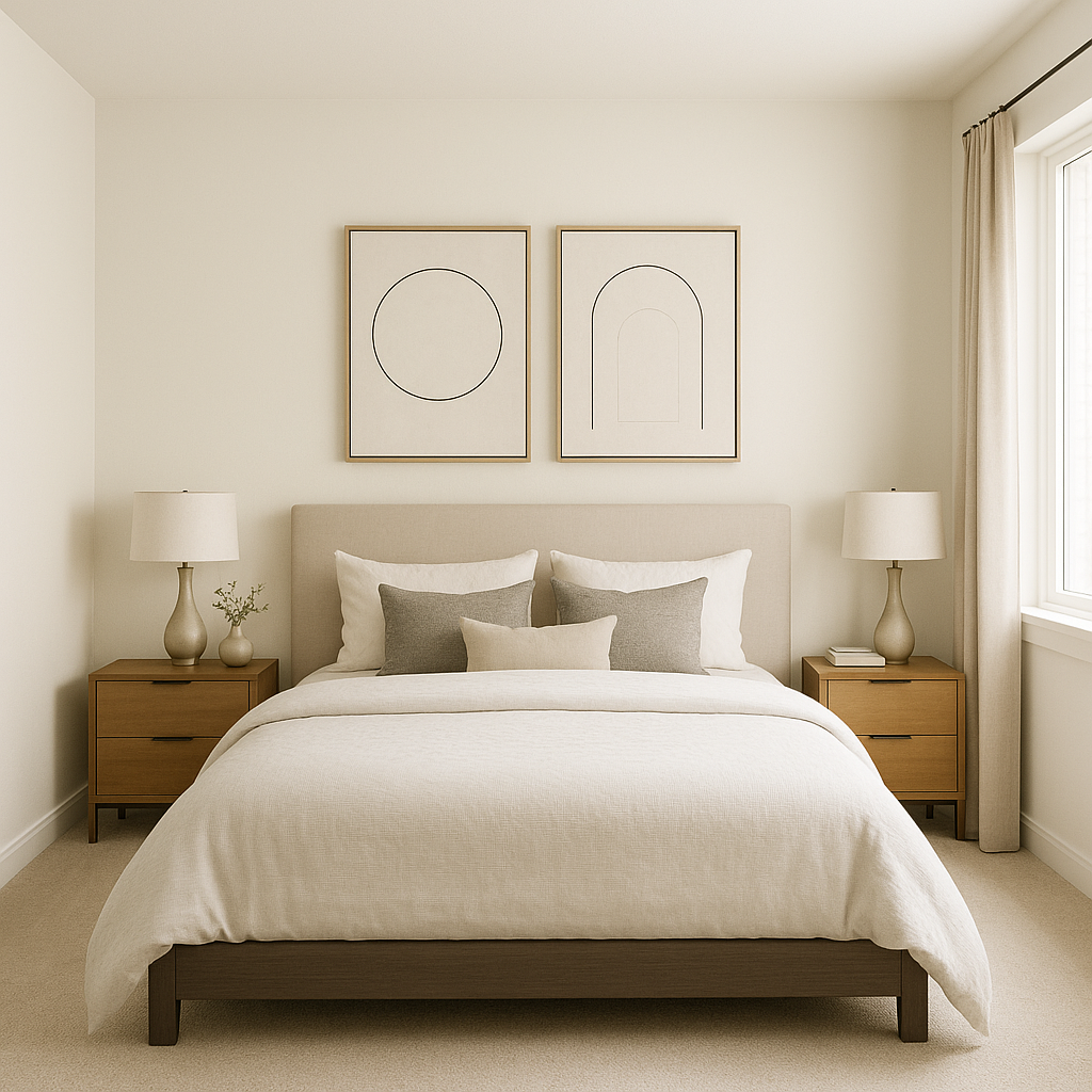
Alabaster is a fantastic choice for walls in both residential and commercial spaces. Its warm undertones create a welcoming ambiance, making it perfect for living rooms, bedrooms, dining areas, and entryways. The soft white hue reflects natural light beautifully, brightening up spaces without feeling overpowering.
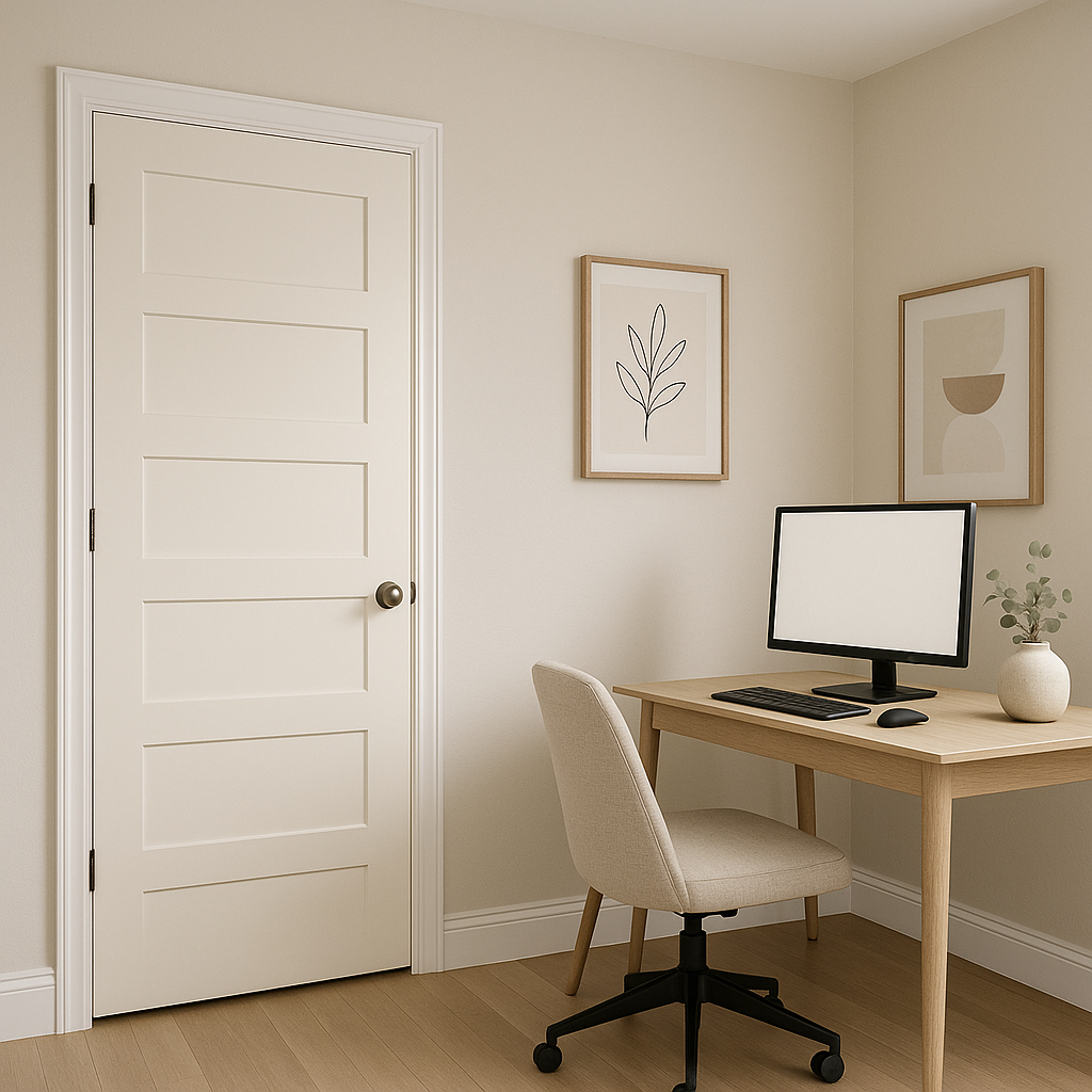
For a clean, polished look, Alabaster works wonderfully on trim, moldings, and ceilings. Pair it with a contrasting wall color to highlight architectural details or use it throughout for a seamless, monochromatic appearance.
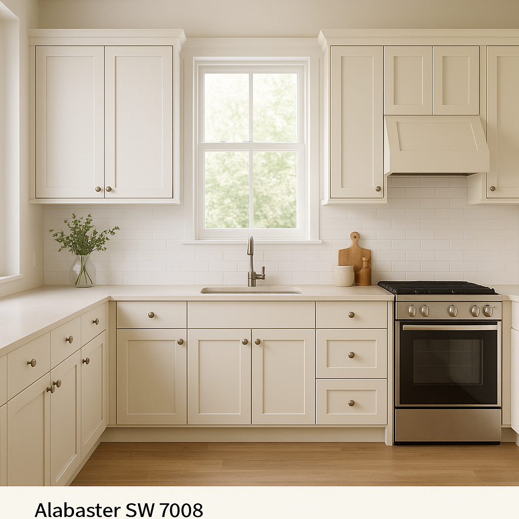
Create a fresh, airy aesthetic in kitchens and bathrooms by using Alabaster on cabinetry or walls. Pair it with brushed nickel or black hardware for a modern touch, or combine it with natural wood tones for a farmhouse-inspired style.
The warmth of Alabaster makes it an excellent choice for exterior spaces. Whether used as the main exterior color or as an accent for trim and shutters, Alabaster provides timeless curb appeal. When paired with darker shades like charcoal or navy, it creates a striking contrast that enhances architectural features.
Alabaster's simplicity makes it a staple for minimalist and modern interiors. Its ability to blend seamlessly with other neutrals and bold accents allows it to serve as the foundation for clean, uncluttered designs.
Sherwin-Williams Alabaster (SW 7008) is more than just a paint color; it’s a tool for transforming spaces into elegant, inviting havens. Its warm, creamy undertones, adaptability with coordinating colors, and versatility across design styles make it one of the most beloved whites in the Sherwin-Williams palette. Whether you're refreshing a single room or planning a whole-home color scheme, Alabaster provides the perfect balance of warmth and sophistication.
Note: These images were all generated with AI, there may be inaccurate color results. Please only use a general reference to get a rough idea of what a color may look like, we will continue to generate new images to improve accuracy.
View Colors Only by Brand (No Imagery):
Sherwin-Williams
|
Benjamin-Moore
|
Behr
|
Valspar
Live on the Eastern Slope of Colorado and looking for a local painting professional, check out all our painting services and reach out for a free estimate.
Copyright © 2026 : Wild Fox Painting Inc. : 12435 Mead Way, Littleton, CO 80125


