Sherwin-Williams Seaworthy (SW 7620) is a striking, deep blue hue that evokes the elegance and timeless appeal of the open sea. Rich and luxurious, this color is perfect for creating spaces that feel grounded yet adventurous. It combines a balance of boldness and subtlety, making it a versatile choice for both statement walls and refined accents. Whether you're designing a coastal retreat or a modern office space, Seaworthy brings depth, character, and a touch of drama to your interiors.
Seaworthy carries cool undertones with hints of gray, which make it a more muted blue compared to bright or overly saturated options. These gray undertones lend a sophisticated edge to the color, ensuring it remains calming and serene without feeling overly dark or heavy. The almost stormy quality of Seaworthy makes it ideal for creating a moody atmosphere that feels intimate yet upscale.
To bring out the beauty of Seaworthy, pair it with complementary and contrasting tones that enhance its depth. Here are a few coordinating colors to consider:
Neutral Pairings:
Warm Accents:
Cool Complements:
Seaworthy is incredibly versatile, making it suitable for a variety of design styles and applications. Here are some of the most popular ways to incorporate this captivating hue into your interiors:
Seaworthy excels as a feature wall color, adding drama and focus to living rooms, dining areas, or entryways. Pair it with lighter neutrals to balance its boldness while allowing it to command attention as a focal point.
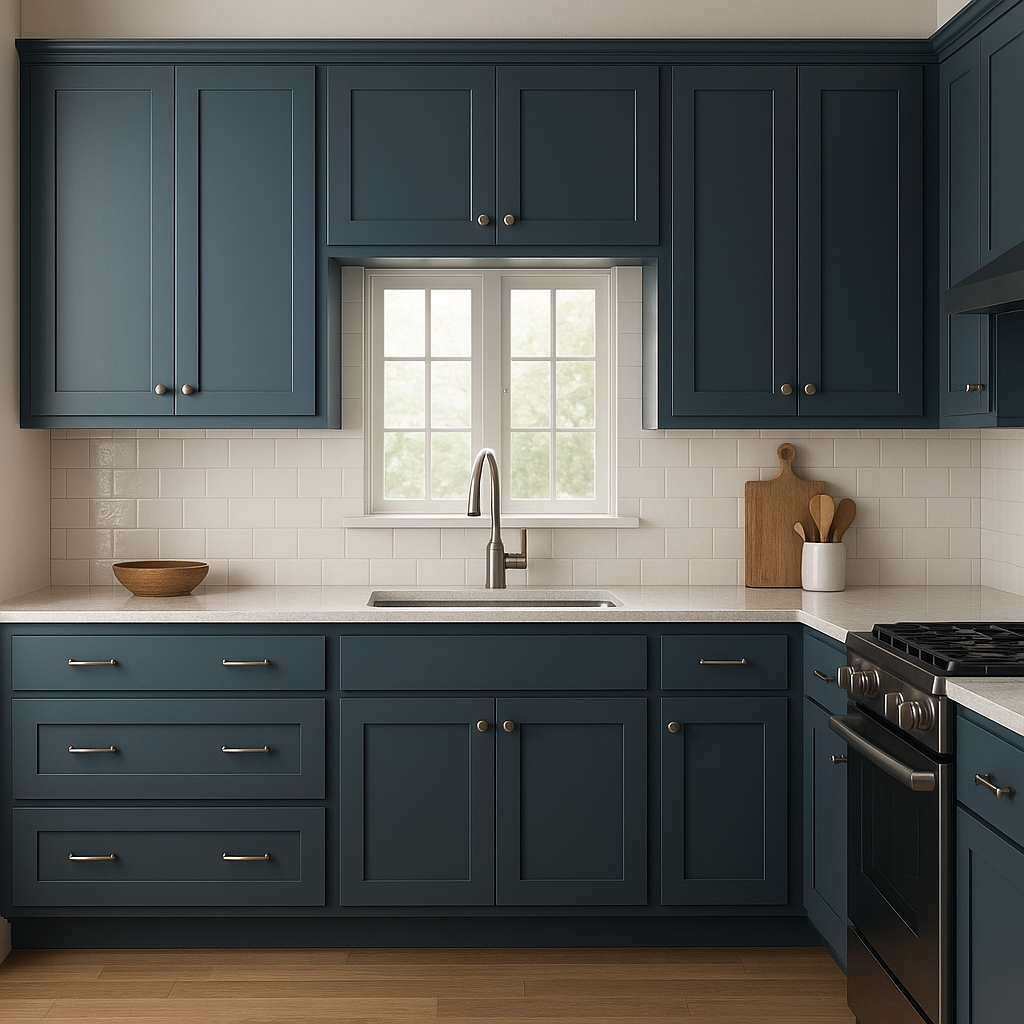
This rich blue is a fantastic choice for kitchen cabinets, bathroom vanities, or built-in shelving. It creates a luxurious and modern look, especially when paired with brass or gold hardware for an extra touch of sophistication.
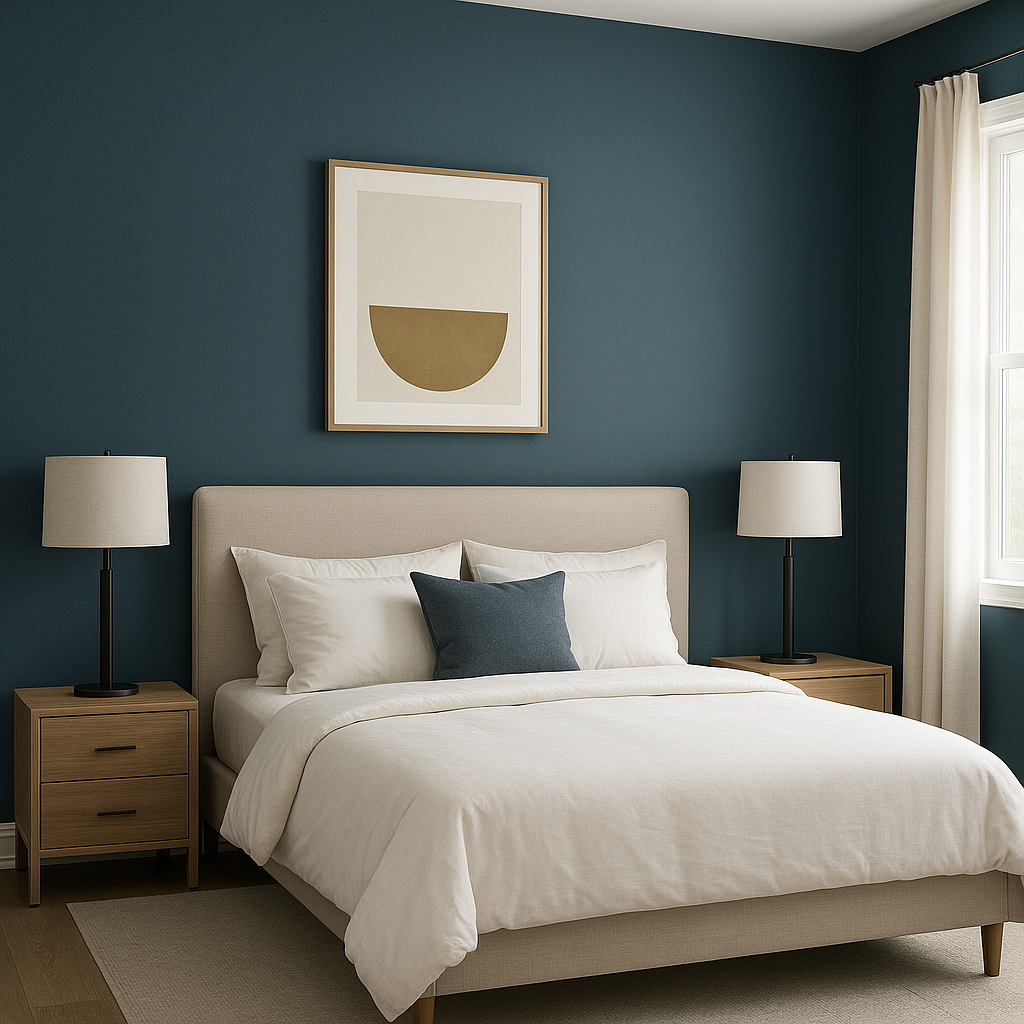
The calming undertones of Seaworthy make it ideal for bedrooms where you want to create a cozy, restful atmosphere. Pair it with soft, plush textiles in whites, grays, or creams for a serene sanctuary.
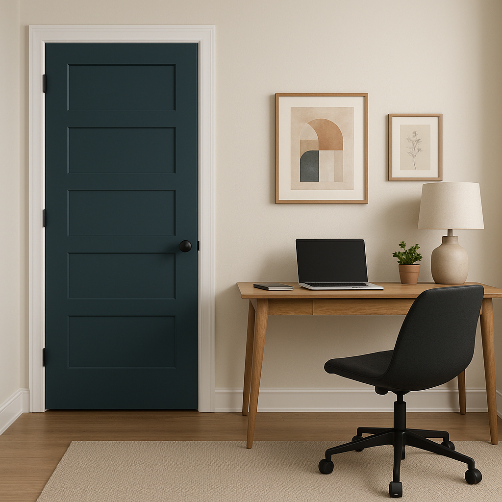
For home offices or studies, Seaworthy provides a sense of focus and grounding. Use it to paint all walls for a cocooning effect, or limit it to one accent wall for added visual interest that inspires productivity.
On the exterior, Seaworthy works beautifully for front doors, shutters, or siding. Its timeless nautical feel pairs well with white trim and natural wood accents, giving your home a sophisticated curb appeal.
Seaworthy is perfect for spaces inspired by coastal, nautical, and modern design styles. It complements natural materials like wood, rattan, and linen while pairing elegantly with metallic finishes such as brass, copper, or chrome. For a modern twist, incorporate it into industrial spaces alongside concrete and black accents.
Sherwin-Williams Seaworthy (SW 7620) is more than just a deep blue—it’s a statement of sophistication and style. Whether you’re creating a bold focal point or a serene backdrop, this color’s depth and versatility make it an exceptional choice for interiors and exteriors alike.
Note: These images were all generated with AI, there may be inaccurate color results. Please only use a general reference to get a rough idea of what a color may look like, we will continue to generate new images to improve accuracy.
View Colors Only by Brand (No Imagery):
Sherwin-Williams
|
Benjamin-Moore
|
Behr
|
Valspar
Live on the Eastern Slope of Colorado and looking for a local painting professional, check out all our painting services and reach out for a free estimate.
Copyright © 2026 : Wild Fox Painting Inc. : 12435 Mead Way, Littleton, CO 80125


