Sherwin-Williams Copper Pot (7709) is an inviting and sophisticated paint color that evokes the rich depth of aged copper and earthy terracotta. With its warm, reddish-brown base and subtle undertones, Copper Pot is the perfect choice for creating spaces that exude comfort, elegance, and timeless charm. Whether you're looking to add a touch of rustic beauty or elevate a modern aesthetic, this versatile shade is sure to deliver.
Copper Pot features soft red and orange undertones that bring warmth and vibrancy to the color, while its brown base grounds it in a sense of stability and richness. These undertones allow it to transition beautifully between rustic, Mediterranean-inspired spaces and refined, contemporary interiors. The earthy nature of Copper Pot gives it a natural connection to elements like wood, leather, and stone, making it an ideal choice for spaces that embrace organic textures.
When designing with Sherwin-Williams Copper Pot, selecting complementary colors can enhance its beauty and create a cohesive palette. Here are some coordinating shades to consider:
Neutral Pairings:
Accent Colors:
Complementary Shades:
Copper Pot is a versatile color with wide-ranging applications across different styles and spaces. Its warm and grounded nature makes it suitable for both residential and commercial interiors. Here are some creative ways to incorporate Copper Pot into your design:
Living Rooms & Dens: Use Copper Pot on accent walls to create a cozy, inviting atmosphere. Pair it with leather furniture, natural wood finishes, and soft neutral textiles for a rustic yet refined aesthetic.
Dining Rooms: Elevate your dining space by painting the walls in Copper Pot. Its rich hue can make meals feel more intimate and luxurious, especially when paired with warm metallics like brass or bronze in light fixtures and décor.
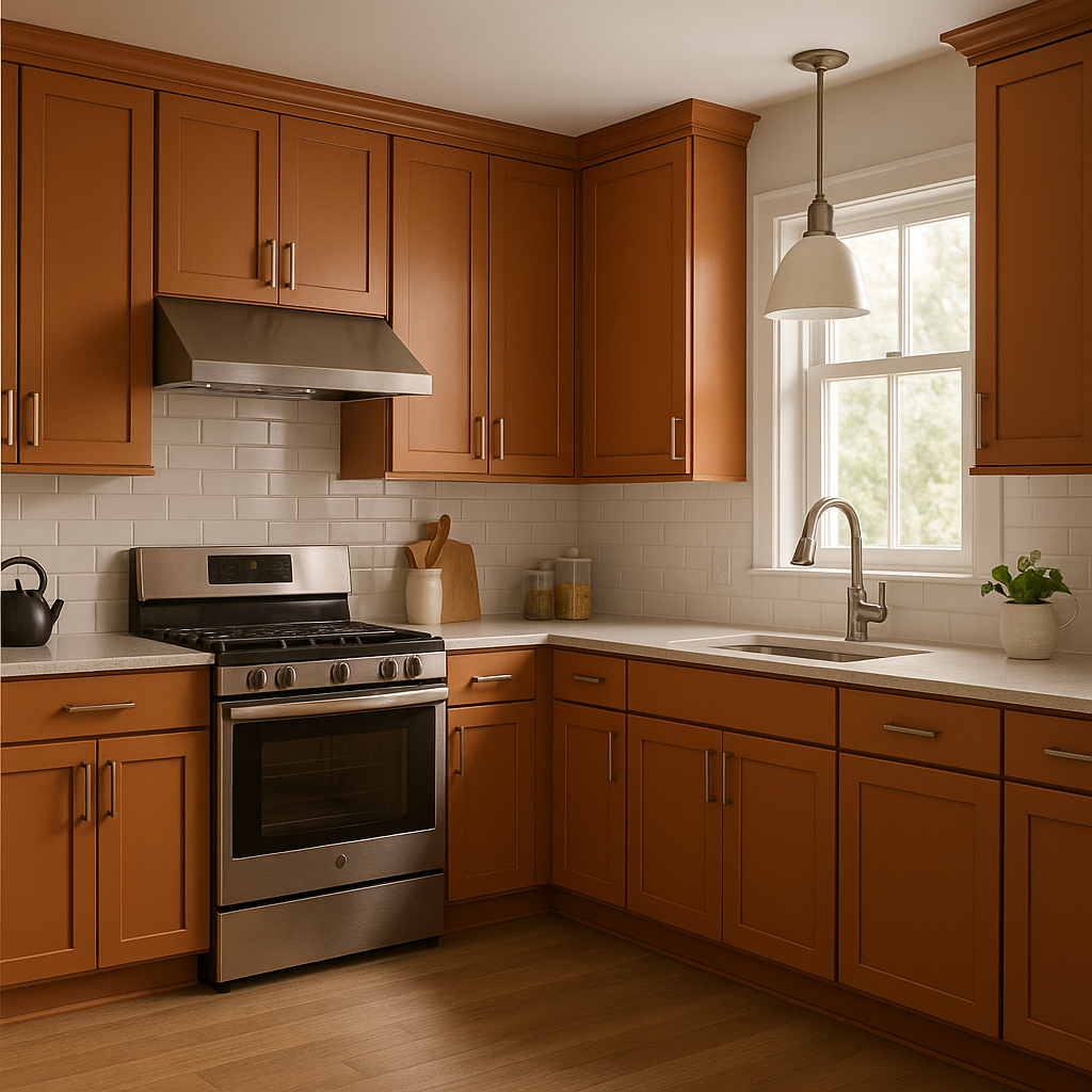
Kitchens: Consider Copper Pot for cabinetry or a feature wall in the kitchen. It pairs beautifully with natural stone countertops, terracotta tiles, and copper hardware, creating a warm and cohesive look.
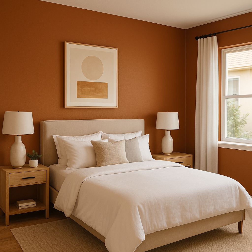
Bedrooms: Use Copper Pot as a backdrop for an earthy, calming retreat. Pair it with soft linens in beige or cream tones, and add pops of greenery for a touch of nature.
Bathrooms: Bring a spa-like ambiance to your bathroom with Copper Pot. Combine it with white or off-white tiles and gold accents for a luxurious and harmonious design.
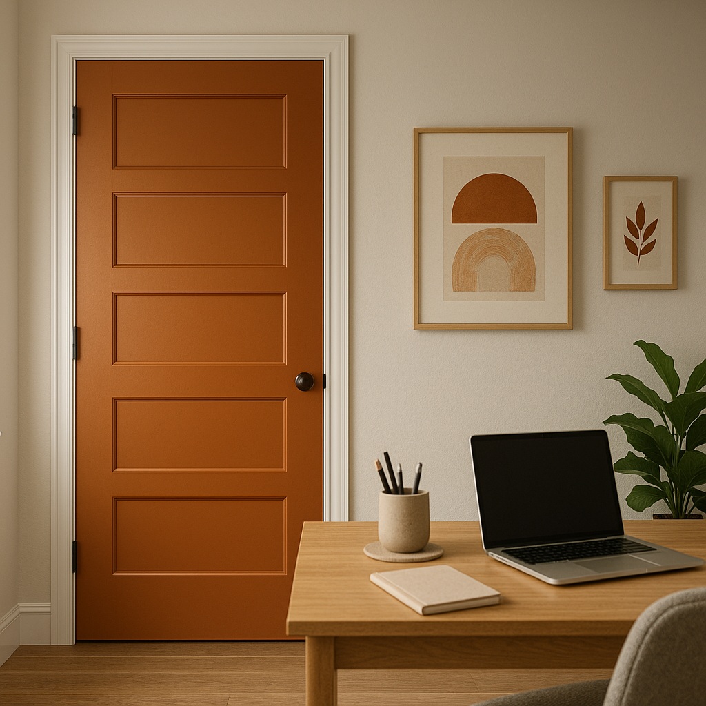
Exterior Applications: Sherwin-Williams Copper Pot is also an excellent choice for exterior siding, trim, or doors. Its earthy elegance works beautifully with stone facades, natural wood finishes, and lush landscaping.
Lighting Considerations: Copper Pot can change dramatically depending on the lighting. In spaces with ample natural light, its reddish undertones will shine, creating a warm and vibrant feel. In dimmer settings, its brown base becomes more pronounced, lending a cozy and grounded ambiance.
Texture Pairings: Incorporate textures like rough-hewn wood, woven fabrics, and matte finishes to highlight Copper Pot's natural and organic vibe. Metallic elements such as copper or gold can enhance its richness and elevate its overall appeal.
Sherwin-Williams Copper Pot (7709) is a color that transforms any space into a warm and welcoming haven. Whether you're designing a cozy living room or a bold exterior, its timeless charm and versatility make it a standout choice for both traditional and modern designs.
Note: These images were all generated with AI, there may be inaccurate color results. Please only use a general reference to get a rough idea of what a color may look like, we will continue to generate new images to improve accuracy.
View Colors Only by Brand (No Imagery):
Sherwin-Williams
|
Benjamin-Moore
|
Behr
|
Valspar
Live on the Eastern Slope of Colorado and looking for a local painting professional, check out all our painting services and reach out for a free estimate.
Copyright © 2026 : Wild Fox Painting Inc. : 12435 Mead Way, Littleton, CO 80125


