Benjamin Moore Blue (1644) is a timeless mid-tone blue that evokes elegance, serenity, and sophistication. With its understated charm, this color offers a versatile choice for interiors, seamlessly adapting to both traditional and contemporary design aesthetics. Whether you're looking to create a calming retreat or a bold statement, Blue (1644) delivers a balanced hue that feels fresh yet grounded.
This shade leans toward a neutral blue, with soft gray undertones that temper its vibrancy and add depth. The subtle gray influence helps it avoid becoming too bright or overpowering, making it a highly adaptable color for various lighting conditions. In spaces with abundant natural light, Blue (1644) showcases its crisp and clean character, while in dimmer lighting, the gray undertones become more pronounced, lending a muted, sophisticated feel.
Blue (1644) pairs beautifully with a wide range of colors, allowing for flexible and harmonious interior designs. Here are some coordinating options:
Blue (1644) is an excellent choice for creating tranquil and balanced interiors. Its adaptability makes it suitable for a variety of spaces:
Transform your living area into a stylish, serene retreat by using Blue (1644) on the walls. Pair it with light-colored furniture and metallic accents to elevate the sophistication of the space.
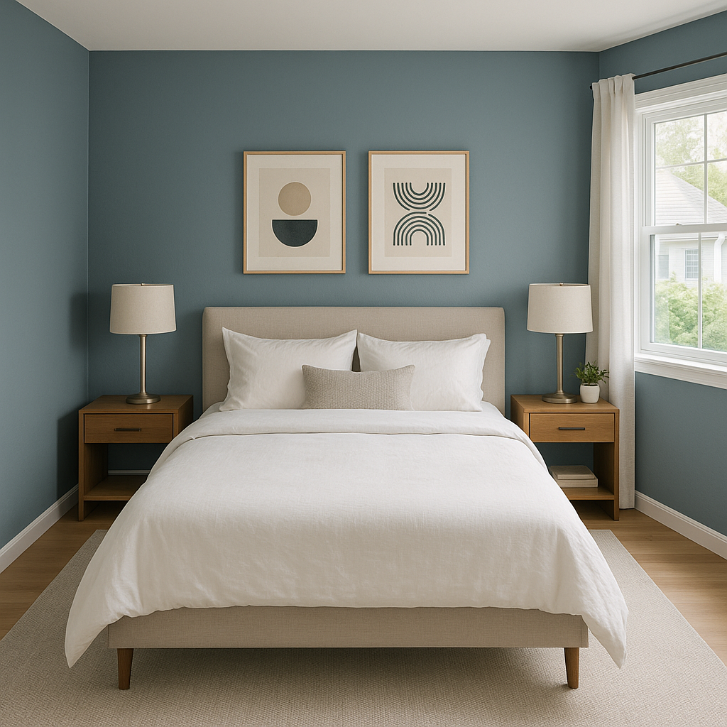
This soothing shade is perfect for bedrooms where relaxation is key. Pair it with soft, creamy whites or muted grays for a dreamy, restful atmosphere.
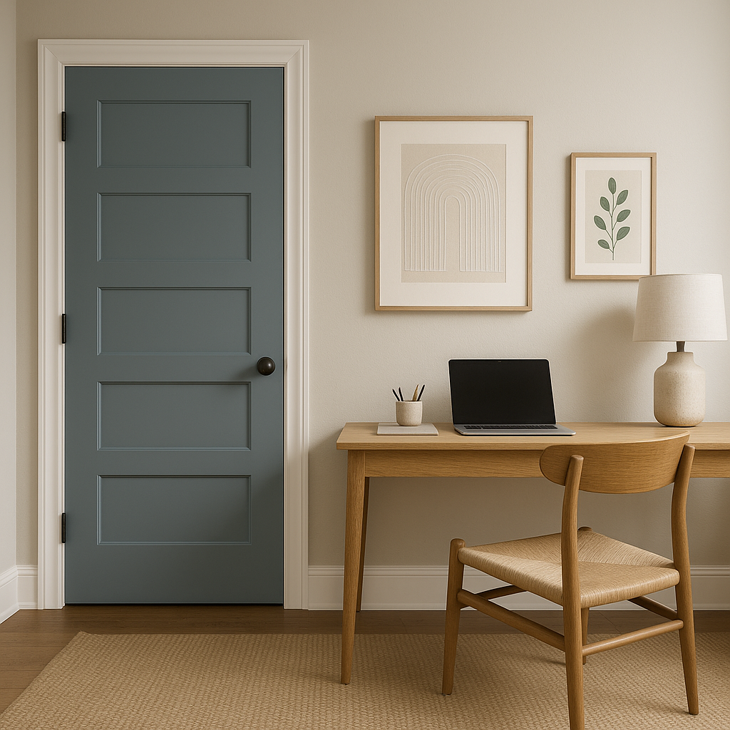
Blue is known for its calming and focused qualities, making it ideal for workspaces. Use Blue (1644) to create a productive and inspiring environment.
Bring a spa-like feel to your bathroom by using Blue (1644) alongside crisp whites and polished chrome finishes. The combination evokes cleanliness and tranquility.
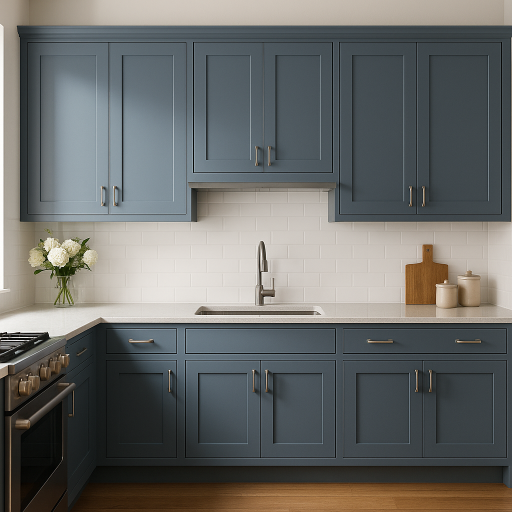
Create a fresh, coastal-inspired kitchen by incorporating Blue (1644) on cabinets or walls. Pair it with warm woods and neutral countertops for a balanced, inviting look.
The appearance of Benjamin Moore Blue (1644) depends heavily on lighting. In rooms with natural light, the blue feels bright and fresh, while artificial lighting can emphasize its gray undertones, creating a more subdued mood. Test the color in your space during different times of the day to ensure it aligns with your desired ambiance.
Benjamin Moore Blue (1644) is an enduring and versatile choice for any interior design project. Its refined undertones and ability to complement a wide range of colors make it an essential addition to a designer’s palette. Whether used as the primary wall color or as part of a layered scheme, this shade promises to deliver effortless sophistication and timeless appeal.
View Colors Only by Brand (No Imagery):
Sherwin-Williams
|
Benjamin-Moore
|
Behr
|
Valspar
Live on the Eastern Slope of Colorado and looking for a local painting professional, check out all our painting services and reach out for a free estimate.
Copyright © 2026 : Wild Fox Painting Inc. : 12435 Mead Way, Littleton, CO 80125


