Benjamin Moore Adirondack (453) is a versatile and timeless paint color that brings a sense of serenity and balance to any space. This soft, warm neutral is a crowd-pleaser for its ability to bridge classic and contemporary design aesthetics with ease. Whether you're refreshing a single room or reimagining your entire home, Adirondack offers a subtle yet sophisticated backdrop that stands the test of time.
Adirondack is a beautifully balanced beige with gentle gray undertones. These cool gray notes temper the warmth of its beige base, making it neither too yellow nor too cold. This harmonious balance ensures it adapts seamlessly to varying light conditions, appearing slightly warmer in natural sunlight and more grounded in spaces lit by artificial light. The nuanced undertones make Adirondack a chameleon-like hue, perfect for creating a cohesive canvas that complements a wide range of colors and finishes.
Adirondack (453) serves as a neutral foundation that pairs beautifully with a variety of shades, from soft pastels to bold, dramatic tones. Here are some exceptional coordinating colors to consider:
Soft Whites and Creams: Pair Adirondack with Benjamin Moore’s Simply White (OC-117) or White Dove (OC-17) for a crisp, clean look ideal for trim, ceilings, and cabinetry. These whites enhance Adirondack’s subtle warmth while maintaining a fresh and airy feel.
Earthy Greens: Create a natural and grounded palette by pairing Adirondack with Benjamin Moore’s Fernwood Green (2145-40) or Saybrook Sage (HC-114). These earthy greens complement Adirondack’s warm undertones and evoke a sense of tranquility.
Sophisticated Blues: For a modern contrast, consider Benjamin Moore’s Van Deusen Blue (HC-156) or Wedgewood Gray (HC-146). The deep and muted blues balance Adirondack’s warmth, creating a serene and contemporary look.
Rich Charcoals: Add drama and depth by coordinating Adirondack with Benjamin Moore’s Kendall Charcoal (HC-166) or Chelsea Gray (HC-168). These darker hues create a striking contrast and elevate the overall sophistication of your space.
Adirondack is an incredibly versatile neutral, making it suitable for a variety of interior design applications. Its understated elegance allows it to shine as a backdrop while enhancing the beauty of surrounding elements. Here are some popular uses for this timeless shade:
Adirondack’s soft, inviting nature makes it an excellent choice for living rooms, family rooms, and open-concept spaces. It creates a warm and welcoming atmosphere without overpowering the room, allowing furniture, artwork, and decor to take center stage.
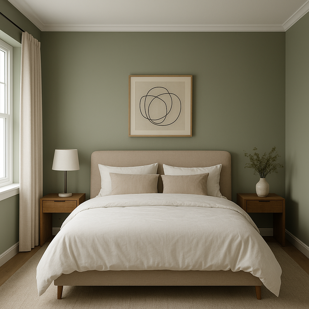
For bedrooms, Adirondack offers a calming and restful ambiance that promotes relaxation. Pair it with plush textiles, layered bedding, and soft lighting for a cozy retreat.
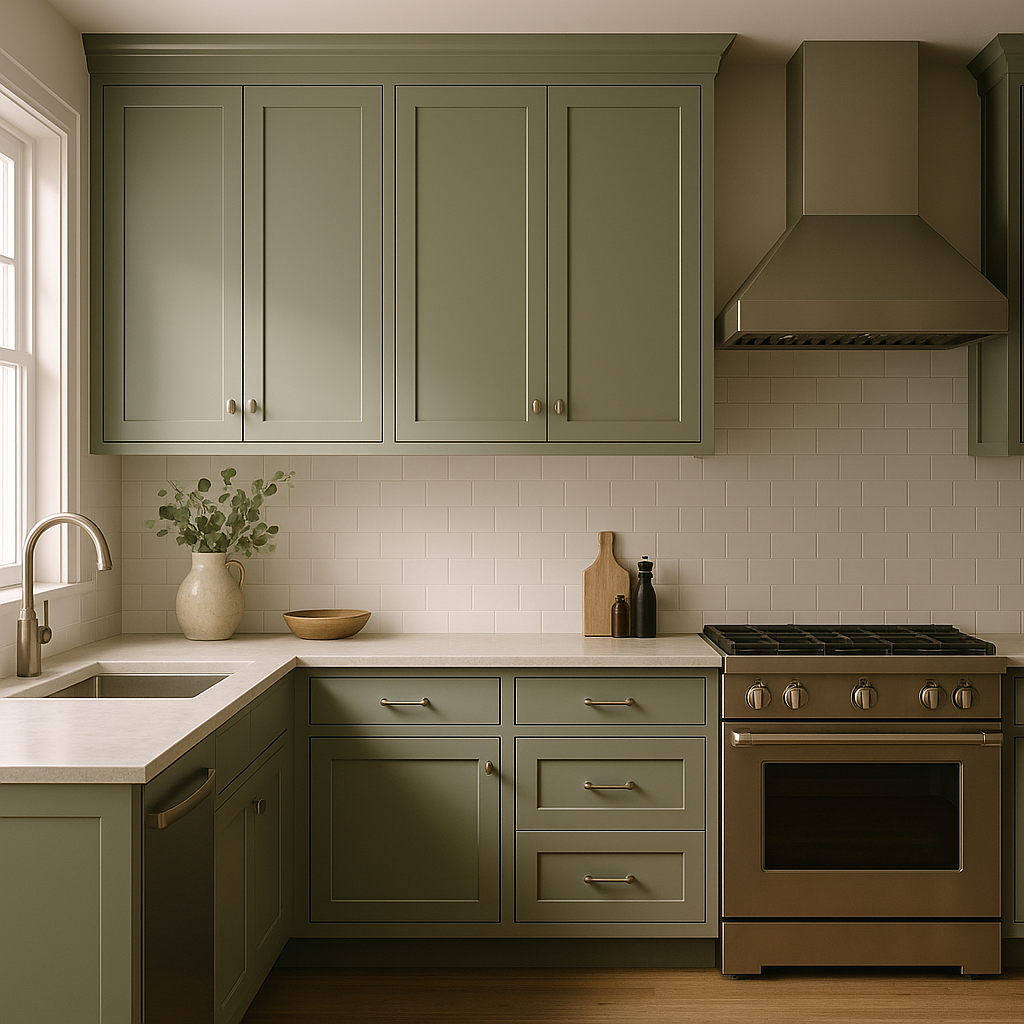
Adirondack works beautifully in kitchens and dining areas, especially when paired with white or cream cabinetry. The subtle contrast between the walls and trim adds depth and dimension, while the neutral base provides an elegant and classic look.
Bring a spa-like quality to your bathroom by using Adirondack on the walls. Its warm undertones pair effortlessly with natural stone, marble, or soft metallic finishes, creating a soothing and sophisticated environment.
As a neutral with wide appeal, Adirondack is a perfect choice for transitional spaces like hallways and entryways. Its ability to adapt to different lighting conditions ensures it looks stunning throughout the day.
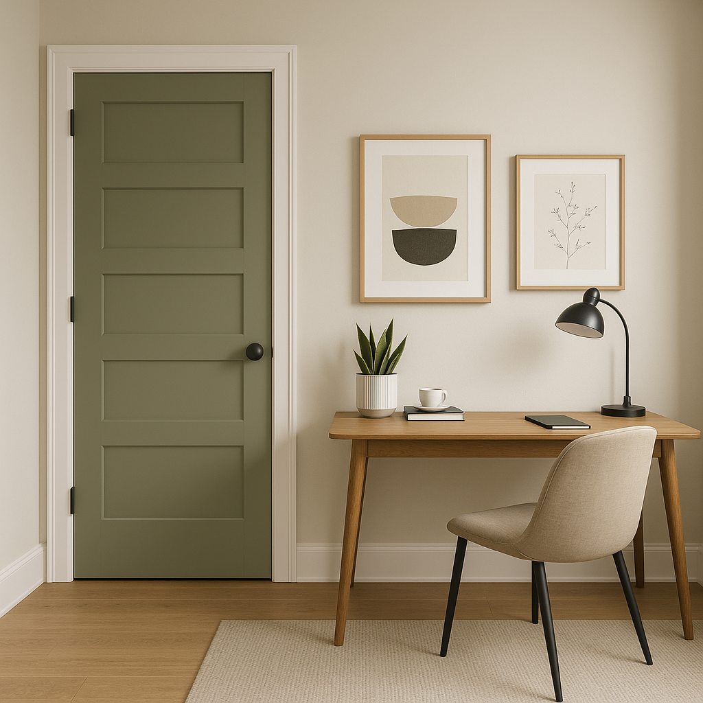
Adirondack’s balanced undertones make it an ideal choice for home offices, where it fosters focus and productivity. Pair it with deep accent colors or natural wood finishes for a polished and professional look.
Benjamin Moore Adirondack (453) is more than just a paint color—it’s a design solution. Its neutral warmth, subtle gray undertones, and adaptability make it a go-to option for homeowners and designers alike. Whether you're creating a modern minimalist sanctuary or a cozy traditional retreat, Adirondack provides the perfect foundation for your vision. With its ability to coordinate effortlessly with a wide range of hues and finishes, this shade is a timeless investment in your home’s aesthetic.
View Colors Only by Brand (No Imagery):
Sherwin-Williams
|
Benjamin-Moore
|
Behr
|
Valspar
Live on the Eastern Slope of Colorado and looking for a local painting professional, check out all our painting services and reach out for a free estimate.
Copyright © 2026 : Wild Fox Painting Inc. : 12435 Mead Way, Littleton, CO 80125


