Sherwin-Williams Birdseye Maple (2834) is a soft, versatile neutral that exudes warmth and sophistication. With a creamy beige base and subtle golden undertones, this shade is inspired by the natural beauty of birdseye maple wood. Its understated elegance makes it a perfect choice for creating inviting interiors with a classic yet contemporary feel.
The gentle golden undertones in Birdseye Maple add warmth and dimension to the paint color, making it feel cozy without overpowering the space. These undertones bring a sense of natural richness, akin to the patina of aged wood or the glow of soft sunlight. This balanced warmth ensures it pairs beautifully with both cool and warm palettes, allowing for incredible versatility in design.
Birdseye Maple thrives when paired with complementary hues that enhance its warmth. Here are some coordinating colors to consider:
These coordinating colors can be used to craft a cohesive palette that works across rooms, providing a seamless flow throughout your home.
Birdseye Maple is a versatile paint color that works beautifully in a variety of spaces and design styles. Here are some ideas on where and how to use it:
Transform your living room into a cozy haven by using Birdseye Maple on the walls. Its warm undertones create an inviting atmosphere, while pairing it with neutral furnishings and natural textures like wood or linen adds a touch of understated elegance.
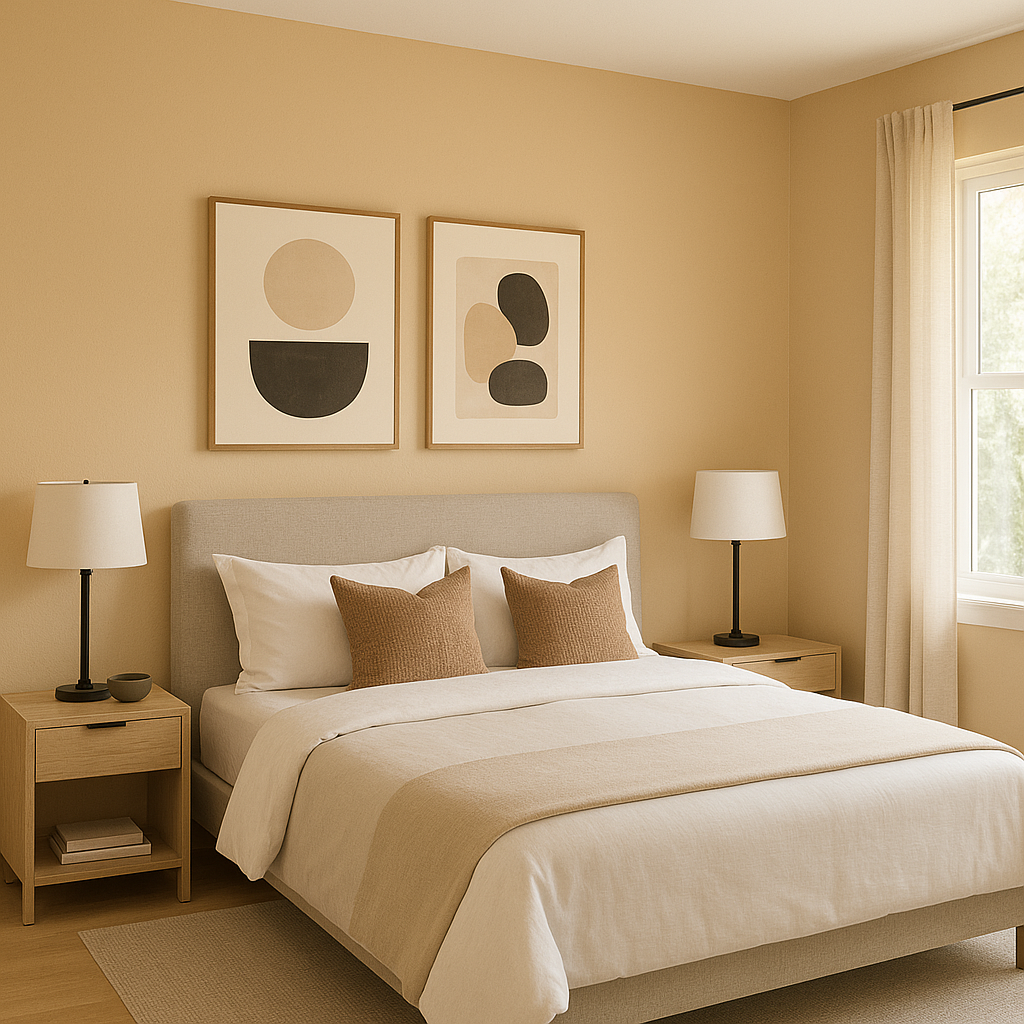
Create a tranquil retreat in your bedroom by choosing Birdseye Maple for the walls. The softness of the color lends itself well to relaxation, especially when paired with warm lighting and coordinating textiles like deep browns or soft blues.
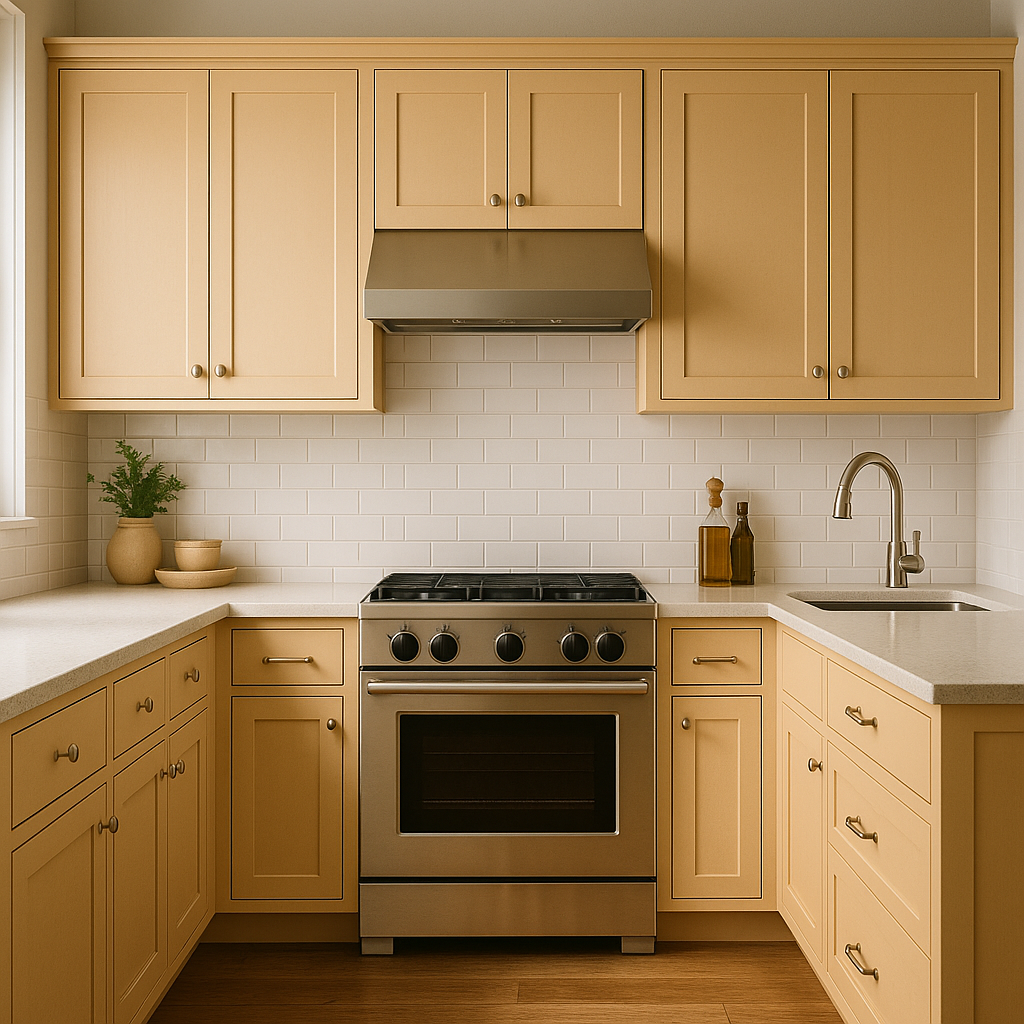
For a timeless kitchen design, Birdseye Maple works beautifully on walls, cabinetry, or kitchen islands. Pair it with white countertops and brass hardware for a modern yet classic aesthetic.
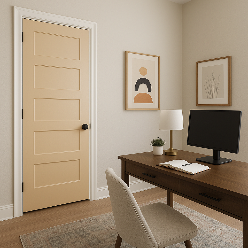
Elevate transitional spaces such as hallways or entryways by painting them in Birdseye Maple. The warm neutral tones create a welcoming first impression and ensure your home feels cohesive as guests move between rooms.
Sherwin-Williams Birdseye Maple (2834) is more than just a neutral—it’s a timeless canvas that adapts to your personal style while adding warmth and character to your home. Its ability to pair effortlessly with a variety of colors and textures makes it a go-to choice for homeowners and designers alike.
Whether you’re creating a cozy living room, a serene bedroom, or a welcoming entryway, Birdseye Maple is sure to elevate your space with its inviting charm and versatile appeal.
Note: These images were all generated with AI, there may be inaccurate color results. Please only use a general reference to get a rough idea of what a color may look like, we will continue to generate new images to improve accuracy.
View Colors Only by Brand (No Imagery):
Sherwin-Williams
|
Benjamin-Moore
|
Behr
|
Valspar
Live on the Eastern Slope of Colorado and looking for a local painting professional, check out all our painting services and reach out for a free estimate.
Copyright © 2026 : Wild Fox Painting Inc. : 12435 Mead Way, Littleton, CO 80125


