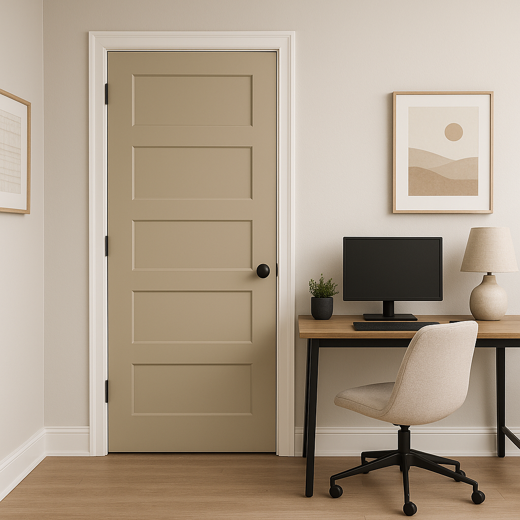
Sherwin-Williams Relaxed Khaki (SW 6149) is a versatile, earthy neutral with a natural sophistication that creates a warm and inviting atmosphere in any room. This balanced shade is a seamless blend of taupe and beige, offering a grounded yet airy feel that appeals to a wide range of design aesthetics. Whether used as a backdrop for bold décor or paired with other subtle tones for a cohesive palette, Relaxed Khaki is a go-to color for those seeking understated elegance.
Relaxed Khaki carries soft green and gray undertones, which give it a tranquil and organic vibe. These subtle undertones allow it to adapt beautifully to various lighting conditions. In natural light, the green undertones become more prominent, lending the shade a fresh and calming quality. Under artificial or warm lighting, the gray undertones create a cozy, muted effect that feels both contemporary and timeless.
Its undertones make it a chameleon-like neutral, shifting slightly depending on its surroundings yet always maintaining a sophisticated balance. This flexibility is part of what makes Relaxed Khaki such a popular choice for interiors.
Relaxed Khaki pairs effortlessly with a variety of colors, making it a versatile option for any design scheme. Here are some excellent choices for complementing this shade:
Whites and Off-Whites:
Pair Relaxed Khaki with crisp whites like Sherwin-Williams Alabaster (SW 7008) or creamy tones like Dover White (SW 6385) to create a fresh, modern look. These lighter hues add contrast while keeping the overall palette soft and harmonious.
Earthy Greens:
Bring out the green undertones of Relaxed Khaki with coordinating shades like Clary Sage (SW 6178) or Softened Green (SW 6177). This combination enhances the organic feel and works beautifully in nature-inspired spaces.
Warm Browns and Taupes:
Enhance the warmth of Relaxed Khaki with rich, warm tones like Virtual Taupe (SW 7039) or Hopsack (SW 6109). These shades create a cozy, layered look perfect for living rooms or bedrooms.
Blues and Navy Tones:
For a striking yet balanced contrast, pair Relaxed Khaki with deep blues like Naval (SW 6244) or subtle blues like North Star (SW 6246). This combination adds depth and sophistication to your space.
Relaxed Khaki is a versatile neutral that works well in any room of the home, from living areas to bedrooms and even exteriors. Here are some creative applications for this timeless hue:
Living Rooms:
Use Relaxed Khaki as the main wall color to create a comfortable and welcoming space. Its warm undertones make it ideal for pairing with natural wood furniture, textured rugs, and soft accent pillows.
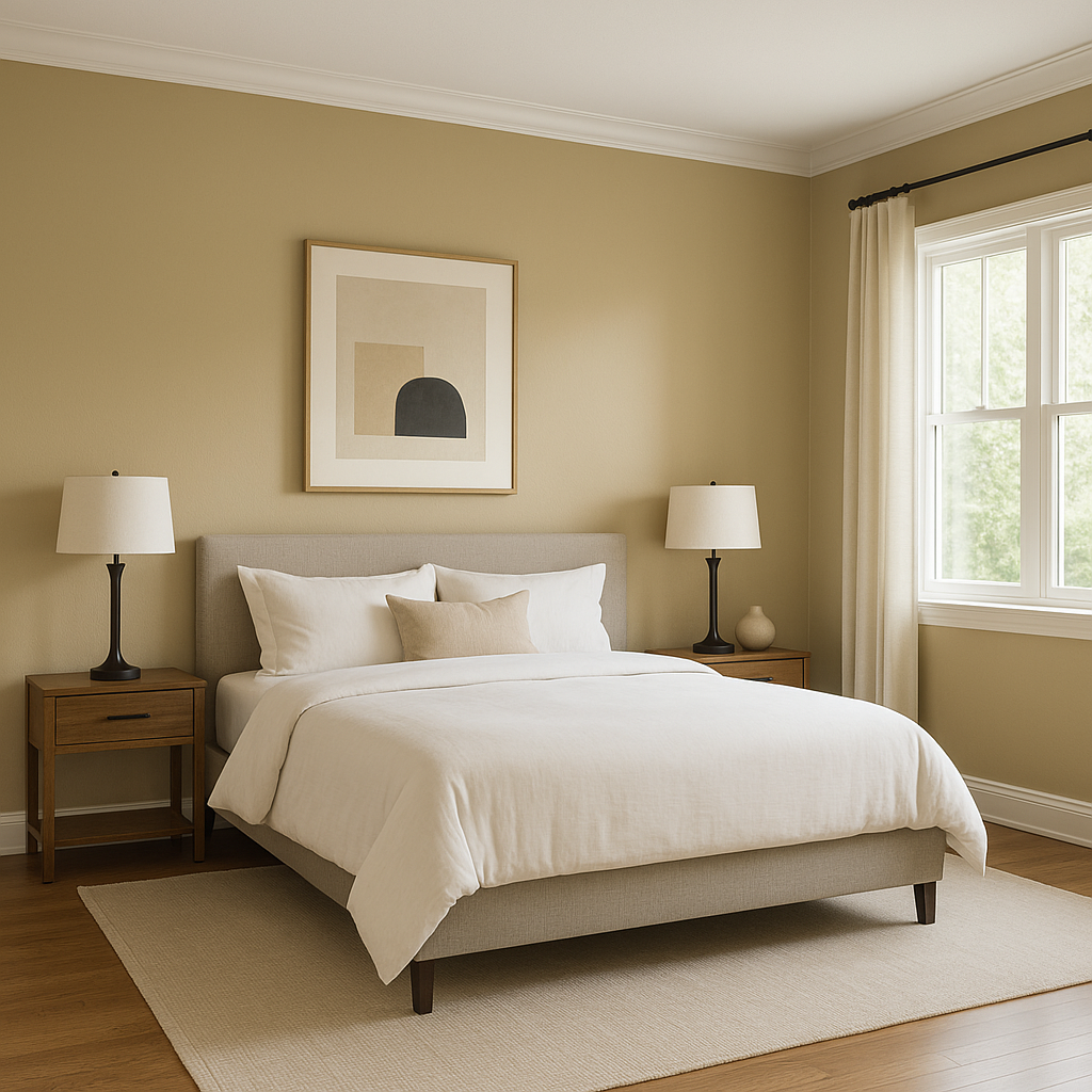
Bedrooms:
Create a restful retreat by using Relaxed Khaki as the primary color, complemented by soft whites and muted greens. Its serene undertones foster relaxation and tranquility, ideal for a calming bedroom atmosphere.
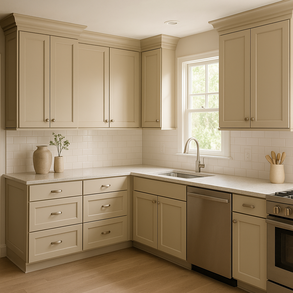
Kitchens and Dining Rooms:
In kitchens or dining areas, Relaxed Khaki works beautifully with white cabinetry, warm wood finishes, and brushed metal accents. It creates a neutral base that allows other design elements to shine.
Bathrooms:
Achieve a spa-like feel by pairing Relaxed Khaki with white subway tiles, soft green accents, and natural stone textures. Its soothing tone contributes to a peaceful and rejuvenating environment.
Exteriors:
Relaxed Khaki is also a great option for exterior siding or trim. Its earthy undertones blend seamlessly with natural surroundings, making it a perfect choice for homes in wooded or coastal settings.
Sherwin-Williams Relaxed Khaki is a masterful neutral that bridges the gap between warm and cool tones. Its versatility, subtle undertones, and ability to complement a wide range of colors make it an excellent choice for any design project. Whether you're aiming for a modern minimalist look or a cozy, traditional vibe, Relaxed Khaki offers the flexibility to bring your vision to life while maintaining a timeless appeal.
Note: These images were all generated with AI, there may be inaccurate color results. Please only use a general reference to get a rough idea of what a color may look like, we will continue to generate new images to improve accuracy.
View Colors Only by Brand (No Imagery):
Sherwin-Williams
|
Benjamin-Moore
|
Behr
|
Valspar
Live on the Eastern Slope of Colorado and looking for a local painting professional, check out all our painting services and reach out for a free estimate.
Copyright © 2026 : Wild Fox Painting Inc. : 12435 Mead Way, Littleton, CO 80125


