Sherwin-Williams Commodore SW 6524 is a rich, deep blue that exudes confidence and sophistication. This timeless hue is the perfect blend of elegance and drama, making it an excellent choice for those looking to create an impactful design statement. Whether you're designing a modern, coastal, or traditional interior, Commodore offers the versatility to enhance a variety of aesthetics.
Commodore SW 6524 is a saturated navy with subtle cool undertones, giving it a clean and crisp appearance. The blue base carries a slight hint of gray, which softens the color and prevents it from feeling overwhelming or too bright. These undertones make Commodore a balanced and approachable shade of navy, perfect for creating a serene and grounded atmosphere.
The gray undertones also lend themselves to versatility, allowing Commodore to adapt seamlessly to different lighting conditions. In natural light, it appears bold and vibrant, while in dimmer settings, it takes on a moody, cocoon-like quality that adds depth and intrigue to any space.
Pairing Commodore SW 6524 with the right coordinating colors can elevate your design to new heights. Here are some exceptional choices to consider:
Whites and Off-Whites:
Complement Commodore's intensity with crisp, clean whites like Extra White SW 7006 or softer tones like Alabaster SW 7008. These shades provide contrast, creating a bright, airy balance against the bold navy.
Grays:
Muted grays such as Repose Gray SW 7015 or Dorian Gray SW 7017 work beautifully with Commodore by enhancing its cool undertones and maintaining a cohesive palette.
Warm Accents:
Add warmth with earthy tones like Accessible Beige SW 7036 or terracotta-inspired shades such as Cavern Clay SW 7701. These colors bring a touch of coziness and balance to the coolness of Commodore.
Vibrant Pops:
For a more adventurous look, consider pairing Commodore with rich mustard yellows like Goldenrod SW 6677 or jewel-toned greens like Ripe Olive SW 6209. These bold accents create a striking and dynamic color story.
This versatile navy is ideal for a wide range of applications, from statement walls to cabinetry. Here are some design ideas to inspire you:
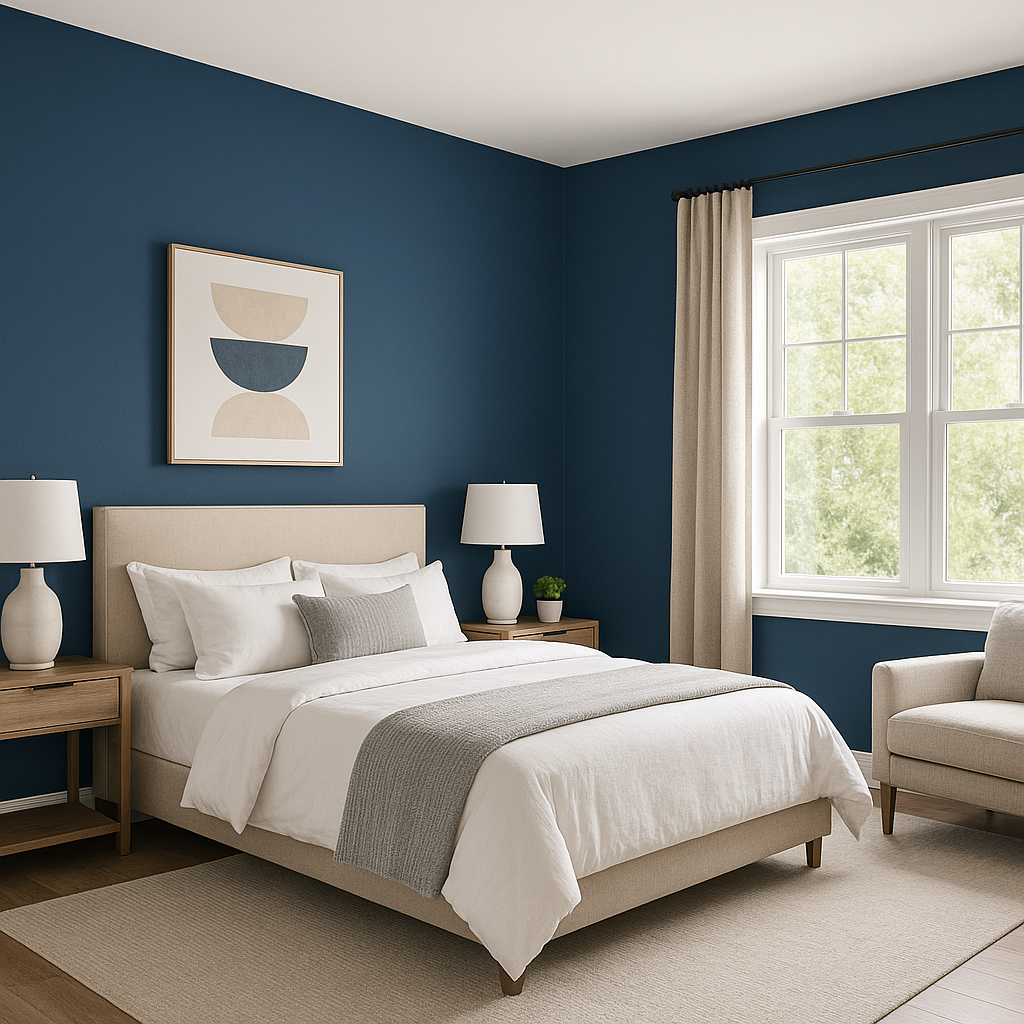
Commodore is the ultimate choice for an accent wall in living rooms, bedrooms, or dining spaces. Its dramatic depth draws the eye and creates a focal point, especially when paired with lighter surrounding walls.
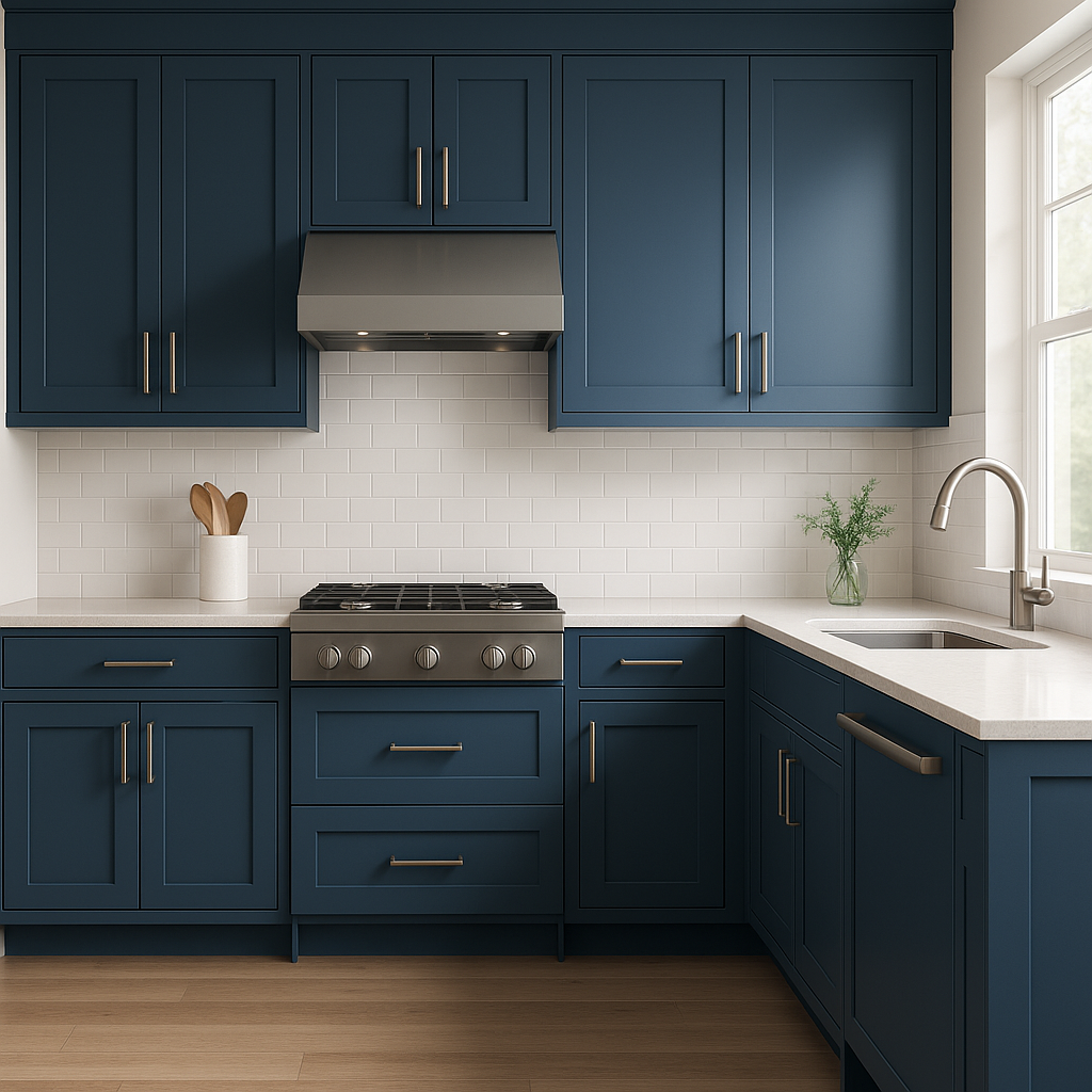
Transform kitchen cabinets, bookcases, or built-in shelving with Commodore's luxurious navy hue. It adds richness and refinement, especially when finished with brass or gold hardware for a touch of glam.
For those looking to make a bold statement in a smaller space, Commodore works wonderfully in powder rooms. Its deep color makes the space feel intimate and luxurious, especially when paired with high-gloss finishes or metallic accents.
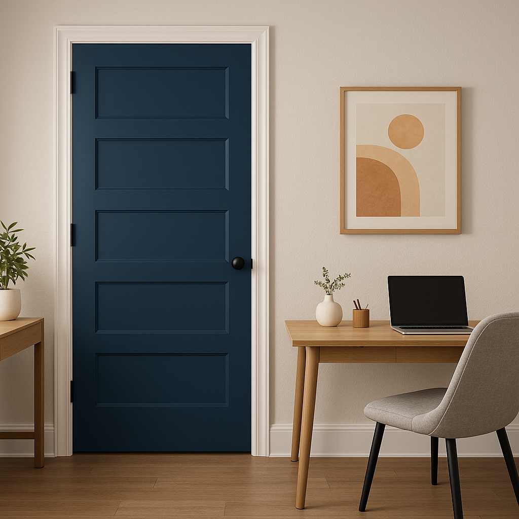
While Commodore shines indoors, it’s equally stunning as an exterior color. Use it for a front door, shutters, or even as the main color for your home's facade. This navy shade looks striking against white trim and natural stone.
For a daring design twist, consider Commodore on your ceiling. This unexpected choice adds drama and dimension, especially in rooms with high ceilings or crown molding.
Note: These images were all generated with AI, there may be inaccurate color results. Please only use a general reference to get a rough idea of what a color may look like, we will continue to generate new images to improve accuracy.
View Colors Only by Brand (No Imagery):
Sherwin-Williams
|
Benjamin-Moore
|
Behr
|
Valspar
Live on the Eastern Slope of Colorado and looking for a local painting professional, check out all our painting services and reach out for a free estimate.
Copyright © 2026 : Wild Fox Painting Inc. : 12435 Mead Way, Littleton, CO 80125


