Sherwin-Williams Champagne (SW 6644) is a luxurious paint color that effortlessly combines warmth and subtle elegance, making it a versatile choice for a variety of interior design styles. This soft beige hue has an inviting personality, perfect for creating cozy, sophisticated spaces that feel refined yet approachable. Champagne exudes a timeless charm, making it a popular choice for homeowners who seek a neutral tone with depth and character.
Champagne (SW 6644) carries warm undertones of soft peach and muted gold, giving it an understated glow that adds richness to any room. These warm undertones prevent the color from feeling overly cool or stark, providing balance and comfort. The subtle peachy warmth makes Champagne ideal for spaces where you want to cultivate a welcoming ambiance without overpowering the design scheme.
Its undertones make it especially suitable for rooms with natural light, as the color’s radiance shifts slightly throughout the day. In brighter spaces, the peach and beige notes become more pronounced, while in dimmer areas, the golden undertones emerge, adding depth.
Sherwin-Williams Champagne is a versatile neutral that coordinates beautifully with a variety of colors. Its subtle warmth makes it compatible with both cool and warm tones, making it easy to create harmonious palettes for any space. Here are some coordinating colors to consider:
Sherwin-Williams Champagne is a go-to neutral that works seamlessly in various spaces, thanks to its ability to adapt to different lighting conditions and aesthetics. Whether you’re designing a cozy retreat or a sophisticated entertaining area, Champagne can deliver the perfect foundation.
Champagne creates a warm and inviting atmosphere in living rooms, making it ideal for spaces where family and friends gather. Pair it with textured fabrics, wooden accents, and metallic finishes to elevate the design and add personality.
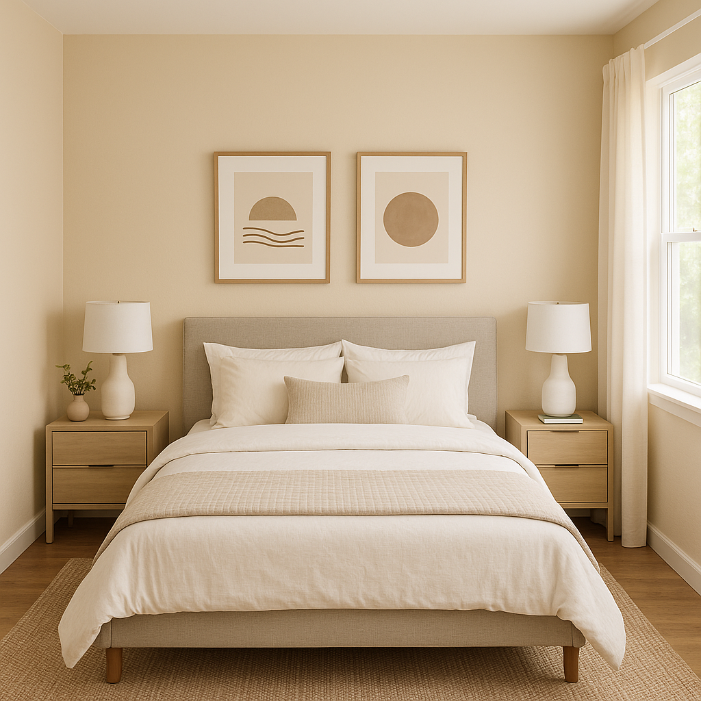
For bedrooms, Champagne’s soothing qualities make it an excellent choice for fostering relaxation. Pair it with soft linens and muted colors for a peaceful, spa-like sanctuary.
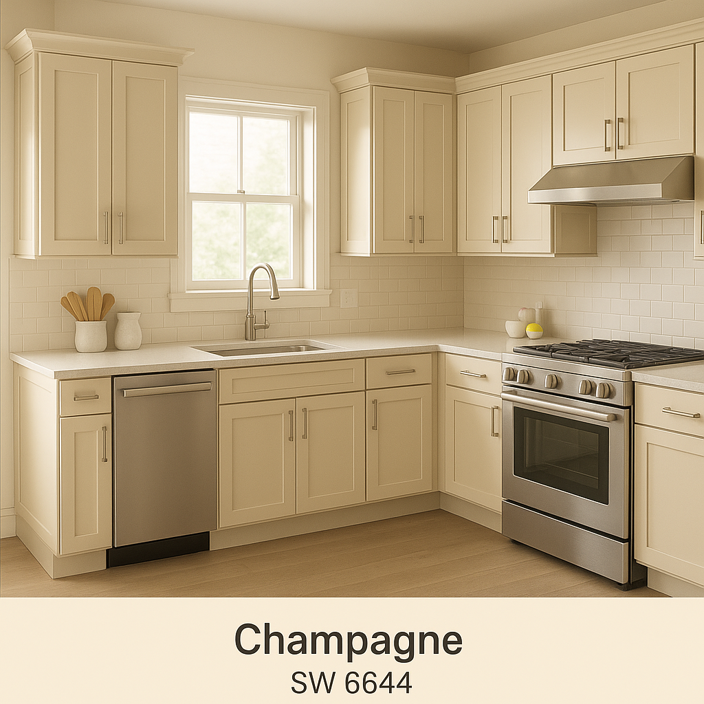
Champagne’s understated elegance adds a touch of sophistication to kitchens and dining rooms. It works well with white cabinetry, marble countertops, and gold or brass hardware for a chic and timeless look.
In bathrooms, Champagne can enhance natural light and make the space feel more open and airy. Combine it with crisp whites and soft blues for a fresh, coastal-inspired palette.
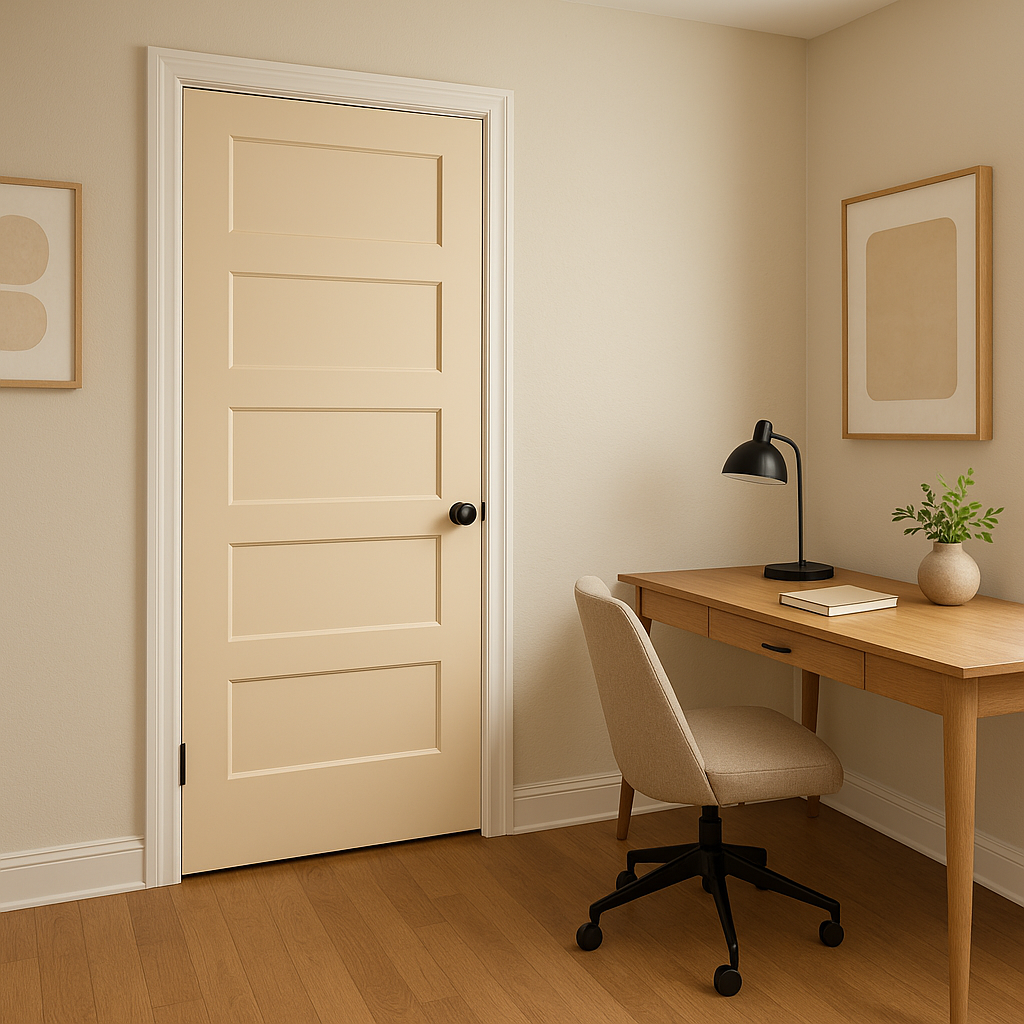
Champagne’s neutrality makes it a great choice for home offices, fostering focus and creativity without distracting from productivity. Pair it with darker accents like navy or charcoal to create a professional yet stylish workspace.
Sherwin-Williams Champagne (SW 6644) offers a perfect balance of warmth and sophistication, making it an excellent option for homeowners and designers alike. Its timeless appeal and versatile nature allow it to shine in a variety of settings, from modern minimalism to classic elegance. Whether used as a primary wall color or as part of a larger palette, Champagne brings an understated yet impactful presence to every room.
Note: These images were all generated with AI, there may be inaccurate color results. Please only use a general reference to get a rough idea of what a color may look like, we will continue to generate new images to improve accuracy.
View Colors Only by Brand (No Imagery):
Sherwin-Williams
|
Benjamin-Moore
|
Behr
|
Valspar
Live on the Eastern Slope of Colorado and looking for a local painting professional, check out all our painting services and reach out for a free estimate.
Copyright © 2026 : Wild Fox Painting Inc. : 12435 Mead Way, Littleton, CO 80125


