
Sherwin-Williams Hazel (SW 6471) is a serene and inviting shade that effortlessly brings the beauty of nature indoors. This soft green hue carries a calming presence, making it an excellent choice for spaces that aim to evoke tranquility and rejuvenation. Whether you're designing a cozy living room, a spa-like bathroom, or a soothing bedroom retreat, Hazel provides a versatile backdrop that harmonizes beautifully with a variety of design styles.
Hazel is a muted green with distinct blue undertones, giving it a cool and refreshing character. These subtle blue notes soften the green, making it feel less saturated and more adaptable to a wide range of interiors. The combination of green and blue undertones gives Hazel its unique ability to feel grounded yet airy, making it perfect for spaces where relaxation and peace are key.
It’s worth noting that Hazel can shift slightly depending on the lighting in your space. In rooms with natural sunlight, it leans toward a fresh, vibrant green, while in dimmer settings or under artificial lighting, its blue undertones may become more pronounced, creating an almost coastal vibe.
Sherwin-Williams Hazel pairs beautifully with both complementary and neutral tones, making it easy to build a cohesive color palette. Here are some coordinating colors to consider:
These coordinating colors allow Hazel to seamlessly integrate into a variety of design schemes, whether you're aiming for a coastal-inspired retreat, a contemporary aesthetic, or a classic farmhouse vibe.
Hazel is an excellent choice for living rooms or family spaces where a comforting and welcoming vibe is desired. Pair it with light wood furniture and natural textures like linen or rattan to create a soft, earthy ambiance. Incorporating houseplants or botanical artwork will further emphasize Hazel’s connection to nature.
The cool, calming undertones of Hazel make it ideal for bathrooms, particularly those styled with a spa-like feel. Use white subway tiles, brushed nickel fixtures, and soft gray towels for a clean, refreshing design. This color can also work beautifully with marble or quartz countertops.
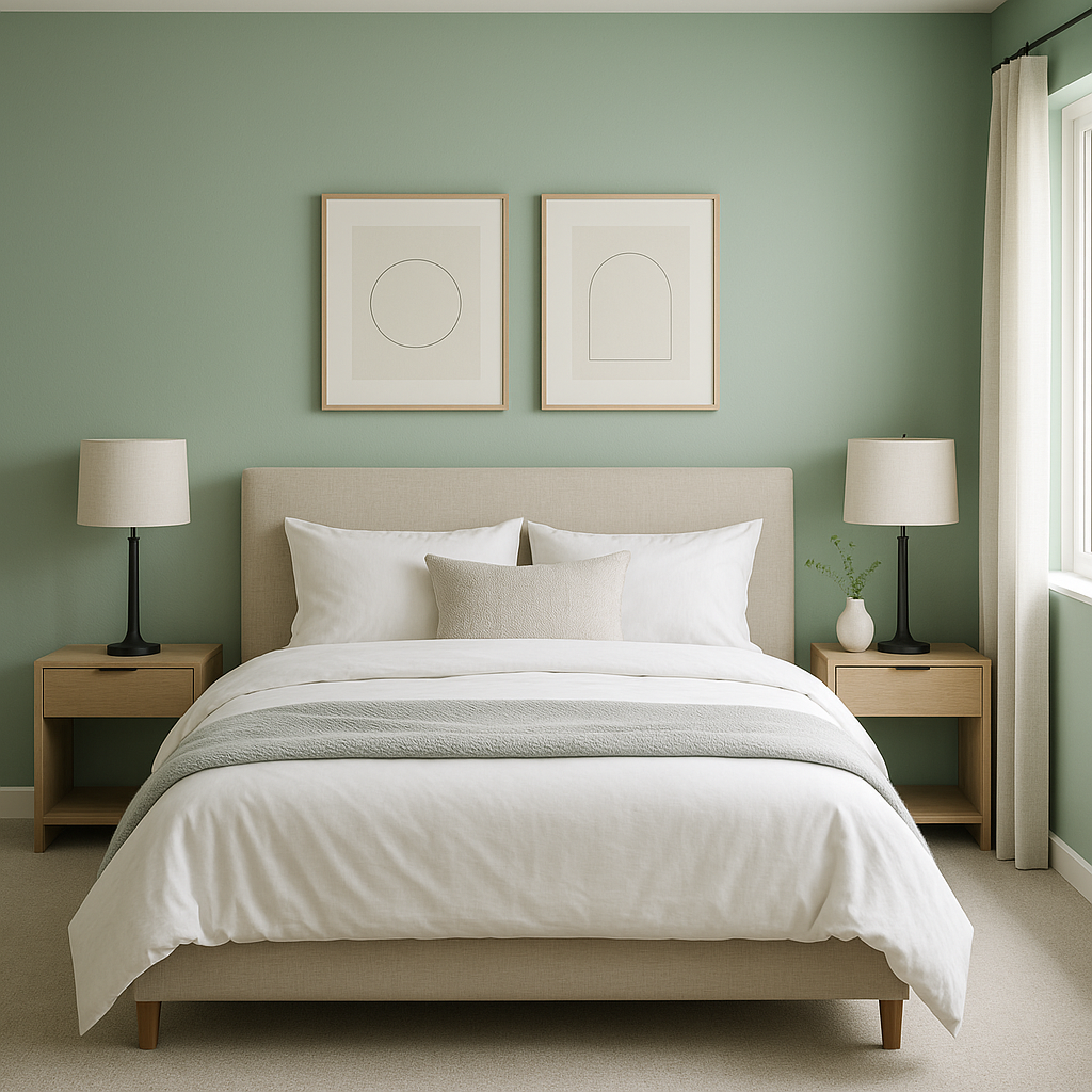
If you’re looking to design a peaceful bedroom retreat, Hazel is a perfect choice. Pair it with plush bedding in neutral tones, such as cream or taupe, and add accents in navy or soft blues to enhance its soothing qualities. The result is a restful space that encourages relaxation and rejuvenation.
Hazel can bring a splash of color to kitchen cabinetry or walls without feeling overwhelming. Pair it with white countertops, a subway tile backsplash, and stainless steel appliances for a fresh and modern look. Add pops of yellow or gold accents, such as bar stools or pendant lights, for a cheerful twist.
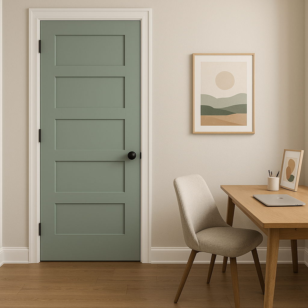
For a productive yet calm workspace, Hazel provides the perfect balance between energy and tranquility. Pair it with dark wood furniture and crisp white accents to keep the space feeling focused and professional.
Sherwin-Williams Hazel (SW 6471) is a color that invites harmony and freshness into any space. Its gentle green-blue undertones, versatile coordinating colors, and ability to adapt across different rooms make it a timeless choice for homeowners and designers alike. Whether you’re seeking a tranquil escape or a lively yet elegant environment, Hazel is a hue that delivers understated charm and endless possibilities.
Note: These images were all generated with AI, there may be inaccurate color results. Please only use a general reference to get a rough idea of what a color may look like, we will continue to generate new images to improve accuracy.
View Colors Only by Brand (No Imagery):
Sherwin-Williams
|
Benjamin-Moore
|
Behr
|
Valspar
Live on the Eastern Slope of Colorado and looking for a local painting professional, check out all our painting services and reach out for a free estimate.
Copyright © 2026 : Wild Fox Painting Inc. : 12435 Mead Way, Littleton, CO 80125


