Benjamin Moore Pale (1584) is a timeless gray that strikes the perfect balance between softness and sophistication. This elegant shade belongs to the cool gray family, offering a gentle, refined aesthetic that complements a wide range of interior styles. Whether you're looking to create a serene retreat or add a polished touch to your home, Pale (1584) provides an understated yet impactful backdrop that feels airy and inviting.
Pale (1584) is not your typical gray. It features delicate blue undertones, giving it a cool, calming essence that makes it suitable for spaces demanding a tranquil atmosphere. Additionally, depending on the lighting, you may notice subtle hints of green peeking through, adding a touch of depth and complexity to the color. These undertones make Pale (1584) feel fresh and modern while maintaining a sense of warmth that prevents it from feeling overly stark or cold.
Benjamin Moore Pale (1584) is incredibly versatile, making it a dream to pair with other colors. Whether you're designing a monochromatic palette or introducing contrasting hues, this shade adapts beautifully.
Pale (1584) is a true chameleon, suitable for a variety of applications and room designs. Its serene nature and understated elegance make it perfect for both modern and traditional interiors.
As a wall color, Pale (1584) offers a soothing backdrop for living rooms. Pair it with crisp white trim and neutral furniture for a classic look, or layer it with bold accent pieces to create visual interest. Its cool undertones ensure it feels fresh and lively, even in larger spaces.
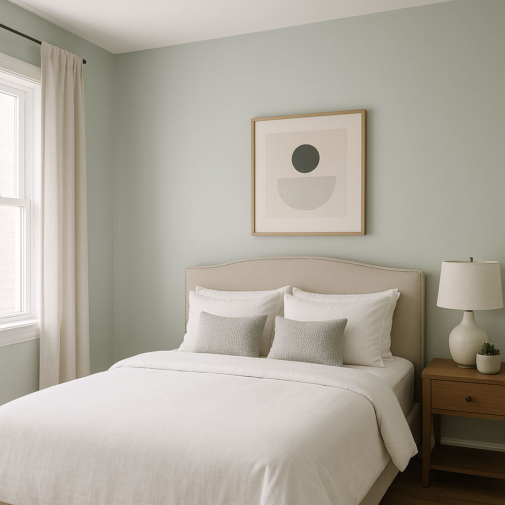
With its calming blue undertones, Pale (1584) is an excellent choice for bedrooms. Use it to create a tranquil oasis by pairing it with soft linens and muted accent colors like blush, sage, or ivory.
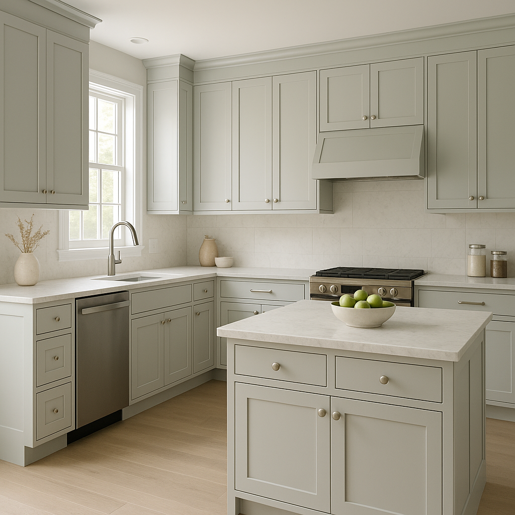
Pale (1584) works beautifully in kitchens and bathrooms, where its cool tones evoke cleanliness and serenity. Pair it with white subway tiles, brushed nickel hardware, and light woods for a modern farmhouse feel.
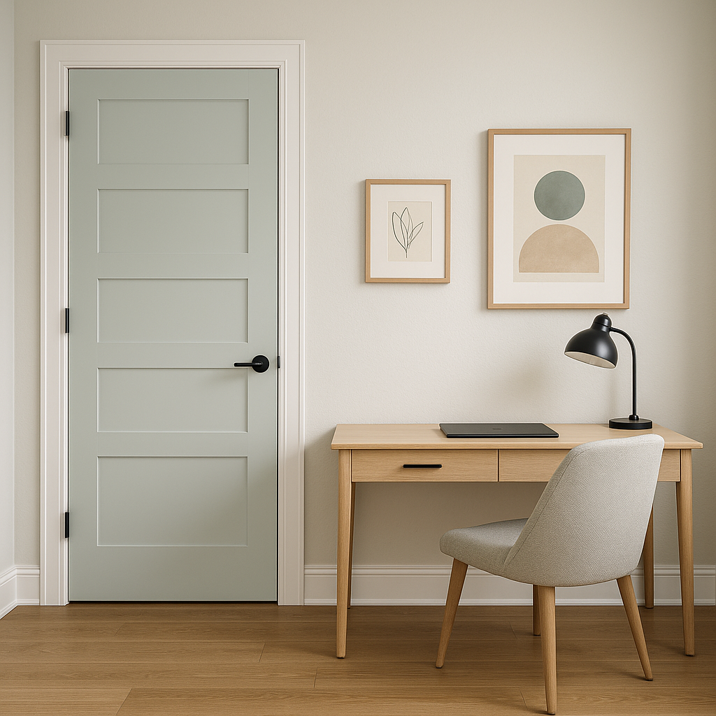
This shade’s versatility shines in home offices, providing a neutral yet inspiring canvas. Its cool gray tones help promote focus and relaxation, especially when paired with darker wood furniture or metallic accents.
Benjamin Moore Pale (1584) is more than just a paint color; it's a design tool that helps set the tone for your space. Its cool elegance, paired with subtle undertones and adaptability, makes it an indispensable choice for both small accents and full-room transformations. Whether you're creating a minimalist haven or adding depth to a layered design, Pale (1584) brings a fresh, sophisticated vibe to your home.
View Colors Only by Brand (No Imagery):
Sherwin-Williams
|
Benjamin-Moore
|
Behr
|
Valspar
Live on the Eastern Slope of Colorado and looking for a local painting professional, check out all our painting services and reach out for a free estimate.
Copyright © 2026 : Wild Fox Painting Inc. : 12435 Mead Way, Littleton, CO 80125


